 We’ve seen a variety of disastrous web design trends over the years. Remember splash pages? All-Flash sites? Frames? We may be on the cusp of a new trend: unstyled ugliness.
The Death of Design?
The big factor driving the move away from visually appealing, highly designed sites is the proliferation of devices used for viewing websites. In Device Fragmentation — The Death of Web Design?, Benjamin Spiegel notes that it isn’t just mobile phones that threaten design. New devices like Google Glass and smart refrigerators lack conventional interfaces like keyboards and browsers but may still be used to display web content. He argues that we are headed for a browserless world in which more and more content is delivered by APIs. This content will be in the form of unstyled data, not web pages.
Spiegel says he’s “extremely excited about the changes and challenges” that will ensue, and predicts the end of web design as we know it.
Google and Starbucks have an ugly baby
I’m a bit less thrilled with the prospect. We’re already seeing a little movement in that direction, and the results aren’t pretty. Starbucks recently dumped their AT&T alliance in favor of Google (at least in the shops I frequent) and went from a nicely styled home page from which one could launch news and other screens to a weirdly Spartan Google-Now-ish look. (The distinctive, albeit wimpy, font is Roboto Thin.) Here’s what the Wall Street Journal content looks like as presented now:
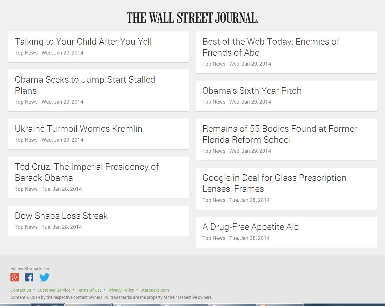
 This display’s only unique feature is the WSJ logo. The articles listed look the same as the articles on similar pages for the New York times and The Economist. There’s no emphasis on individual articles, and there are no images to draw one in. Clicks to the content are entirely dependent on the headline text.
Of course, this kind of display is great from a technical standpoint as it translates easily to mobile. Looking at the mobile screen, other than changing to a single-column display, there’s essentially no difference. I’m sure it would look about the same on an iPad, a Surface, or just about any other device you might show up at Starbucks with.
Unfortunately, these barely-styled pages are so ugly that only a minimalist like Jakob Nielsen could love them. They convey no branding, no emotion, no texture, and no guidance to the viewer.
Not only that, these pages look a lot like other Google Now content. So, if there’s any branding involved, it’s Google’s own.
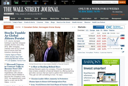
Contrast the minimally styled list of articles with WSJ.com‘s own home page. Using varied fonts, sizes, images, and placement, the visitor can easily scan the page and be guided by the editor’s decisions as to which stories are more important, which article works best with a visual hook, and so on.
I’m seeing this trend replicated to various degrees on other sites. In a quest for device independence, designers are employing minimalist designs that offer little branding and little guidance to the visitor.
Flexibility with Style
Not all highly flexible styling is ugly. I use Flipboard on my Samsung Note 3. Like the Starbucks/Google page, it pulls in content from diverse sources – the “News” section featured adjacent articles from the New York Times, The Telegraph, and TIME. This content was presented in the Flipboard mobile wrapper, but each article had a color photo and retained key branding elements from the source, a logo and distinctive fonts. The Flipboard interface is a pleasure to browse, and the articles retain the texture of their sources.
What do you think about this minimalist trend? Will the proliferation of devices force us into an undesigned future? Or is minimalism a valid design approach that simply needs to be appreciated? Share your thoughts in a comment!
I’ve been wondering about this as well. Mobile needs to be the driver, but that doesn’t mean that you forego crafting the experience, and gently guiding the visitors to accomplish what they need, quickly and painlessly.
I would hope that future responsive design will give the visitor a way to toggle between two mobile-friendly skins — one with the branding and craft, and one that is pure minimalism. I don’t think you will ever have a single umbrella that covers users with both preferences.
Exactly, Ike. If you search for responsive WordPress themes, for example, you’ll find some attractive designs that don’t look like a mobile text screen. But, they’ll function across a wide range of displays. Not sure how well they’ll do on your smart refrigerator, though. 🙂
I would agree with your premise that presentation will and is changing to address cross platform/device requirements but I’m not sure that design has to die to achieve this. Perhaps what is needed is a new structure to deliver the bite size content. Citia is doing some interesting things to structure content into “cards” to deliver a strong and consistent cross-platform branded experience. http://www.citia.com
It should be design for context first and foremost. So a website for a train company should have a graphics light, responsive site so when viewed on the move, they can get to content quickly. No-one is concerned with branding when they want to know when their next train is.
I agree with Ike in that I’d like to see two versions in some cases. A nimble mobile site with reduced content where necessary and then a responsive desktop where the designer has really thought about the content, branding and layout. My customers don’t often go for this.. Simply too resource heavy to run two sites, but it’s a shame.
It’s a real challenge to make a site truly fluid and normally something has to give, tends to be the design as if it’s not simple, it’ll break or be a devil to code into something better.
I totally agree, Paula. I’d throw in the alternative of an app. I use the United Android app on my phone for checking connections, upgrades status, etc. It’s designed to work on phones and performs better than either the regular website or a stripped-down mobile version. And it looks quite good, too.
Paula, we’re not talking about anything resource-intensive.
We’re talking about a new .css file that strips away the sizzle and leaves the contextual data.
Websites have had this for years… Click here for a printer-friendly version.
I completely disagree with the idea that a simplistic clean layout means their is no design behind it. UX/UI design takes into consideration consideration the user experience and interface and a lot of “design” work goes into these concepts. Just because there are not a lot of bells and whistles, doesn’t mean there are not design decisions to be made and designed out by a design.
Clarissa, I agree that minimal design can be great for some purposes. But, if it’s so minimal that content from different brands looks interchangeable, you are losing a branding opportunity. And if you are going to simply show people a list of undifferentiated, identical-looking links, who needs editors?
I just think your underestimating the design that goes into coming up with the correct lists, actions and prompts to engage your user. no matter how simple the actual visual design.
The web has never been a place for refined design/layout – It was created by geeks for geeks whom never studied the arts and took no advantage of what had been learned over the centuries by artists, designers, typographers, etc. So, it doesn’t surprise me that the “for mobile” minimalism trend is showing it’s “ugly” head.
On a side note: Even on the desktop web though there are things that are done that shouldn’t be – For instance, here on your site you have a little overlay for Tweets, social media, contacts – Cool feature man – Until one increases the font size to read the article and the left side is covered by the overlay – Not cool man.
Thanks for that, PXLated, I’ll check that out. Got a recommendation for a good WordPress social sharing plugin?
Sorry, not a WordPress user so don’t.
I don’t think it’s about an undesigned future. It’s a shift towards user-focused design where we get the interface we choose (on our device), rather than the visual expression of each designer (or Web site owner).
This discussion was heated in the late nineties. We had the obscene interfaces of around 2000 dare I mention boo.com?) and since then a gradual return to sanity.
When I click on a Neuromarketing link in my RSS feed it isn’t because I see your colour scheme, logo or cunning Web design elements. Neuromarketing’s branding and emotion is due to your credibility and past writing on here.
Good points, Calum. Indeed, the New York Times survives not because of its design but because of its content. Nevertheless, brands rely on their “trade dress” for memorability and resonance, and when they lose that they suffer.
Calum,
I couldn’t agree with you more!!! People who are attracted to content could care less, for the most part (and I’ll just speak for myself, ok) about the bells and whistles… Give me credibility, THAT will keep me coming back on ALL of my devises!!!
C Alex Garcia
I think the examples in the article show how responsive design and dealing with multiple devices is in it’s early phases, some companies are trying to do the right thing and present content appropriately on each device, but are going too far and subsequently are diluting their brand image or even negatively affecting usability.
As Paula says it needs to be context specific but this has to be balanced with supporting your brand in each individual case.
>>diluting their brand image or even negatively affecting usability
You said that far more concisely than I did, Andy! Those are indeed the key issues I have with the more extreme examples of this trend.
The rise of mobile has definitely changed how websites are designed for this device. For larger inch tablets, a mobile specific site may not be necessary but for a phone, browsing the regular version makes it tough as navigation are usually cumbersome and trying to pinch and scroll around does not help.
I do agree that the pendulum has swung too far the other way for mobile websites. The designs are fairly spartan though functional and the balance for functionality and design can be hard to achieve on a device that is less than 4 inch. This is why many companies ended up created a mobile app version.
I think a lot of it has to do with people trying to use their small devices for things they just aren’t very good at. And we’re trying to accommodate them.
I can’t say I’ve ever gotten a useful (or adequate) reply to an email of any length from a phone. Many times the user will respond with a “call me” rather than responding from their tiny keyboard. Also, since they are on the go, they usually don’t take the time to think through a good, full-fledged response.
I’m not saying we shouldn’t try to accommodate but a one size fits all mobile response probably isn’t the answer. On the other side, people probably shouldn’t expect their mobile device to be useful for all things.
PXLated, to support your theory – there’s research that shows many mobile orders are completed by phone. If a mobile user finds a product to buy, he may opt to call it in vs. fighting through a bunch of form fields on a tiny screen with touch keys.
Interesting – I don’t use my iPhone for those types of things, have my iPad along, so hadn’t thought about that.
Roger
I am very happy with the Spartan look… When I look at the new WSJ page, I and I alone, can decide what catches my attention, topic wise… The former/desktop page, and similar websites have always been far too cluttered for my taste… The interesting thing is that I rarely buy or peruse magazines, unless I’m looking for something specific, i.e., a certain item or “look” I want to emulate… This trend suits me just fine because I’m a gatherer of information and this is a far more efficient way for me to get in, find it, and get out, which I can now spend even more hours doing! :o)
C Alex Garcia
I see your point, Alex. Different content grazing methods, I guess. I use visual cues like a red banner across the top for a breaking news story, a big headline for the most important story of the day (as picked by the front page editor), somewhat smaller headlines for other big news, and a hierarchy of topics like Tech, Business, etc.
But I see where you are coming from. In college, I sometimes bought used textbooks to save a few bucks. Some people loved textbooks that had been underlined/highlighted by the previous owner because they could skim quickly to find the important stuff. I hated that, mainly because it was distracting and I couldn’t be sure that the previous owner had really highlighted the important elements without missing equally important stuff.
[…] favorite apostle of the use of neuroscience in marketing, has a thought-provoking piece, The Death of Design, now playing on his blog. Must reading for anyone thinking beyond […]
As the mother of an Asperger’s autism affected son, these new sites make me think of how his world is perceived- without the non verbal signals of body language, tone of voice, gestures, facial expressions. My son struggles to understand communication and emotional content and suffers from difficulty connecting in meaningful relationships. Sites with no “non-verbal” signals will be like his world, at very high risk for misunderstanding of the real nuanced message. I came to understand him better by realizing his world is one giant email with no emotocons. Is this the future of marketing for all of us?
I consider myself a staunch supporter and believer of the minimal the better approach. I have been blogging for almost 8 months prior to that I had no idea of what website is, how to make one (Honestly I don’t know much even today), I started with a simple template from blogger forum, tweaked it a little like few pages, keeping it less cluttered, making navigation for the visitor easy and swift.
Why did I take that approach, because I always found those bling bling, choked with like 100s of things and gadgets quite a distraction and really confusing. I always found website with a lot of bling bling, lots of colors quite overwhelming, confusing and really making me don’t want to stay on the website.
Even today after learning quite enough I still can’t tolerate all that bling, bling, colors, heap of gadgets, I wonder why do you keep it is so cluttered when the purpose of your website is to make your visitor take a good, peaceful, swift impression, why to hide something under tons of gadgets, colors, columns, buttons this and that , when that something is the main reason of your website, KEEP IT CLEAN, SIMPLE, EASY FOR YOUR VISITOR AND TRUST ME YOU’LL DO GREAT, people don’t come to your website to watch Christmas trees or to do graffiti, they have lots of places where they can find exactly that, your visitors comes to your website for content that is of value to them, so make it easy for them to find, without any clutter, distraction.
And we should learn from the market leaders aka Google, if they are doing it, they know it works, that’s why they are doing it.
@Arshad, It is all on our own perceptions and individual tastes. I have been designing web & print media(s) for the last 10 years and have come to realize that there is no right or wrong on the web in terms of design. It is something to do with human nature/tastes & purpose of the website.
Just as everyone does not wear the same types of clothes, same goes for the web. So, let’s say I am on official business, I would obviously wear formal clothes – simple, strong & non-flashy. Now, let’s say I am a bartender – how dumb would it look if I wear a formal suit and pour drinks. My point being there is no right or wrong type of website design.
We all know – a right/good design is one which delivers the message/information of the website in the most simplest and efficient manner. But doesn’t necessarily mean it has to always be minimal. And just because Google or any major corporation has gone minimal doesn’t mean it will work for you and me as well. It is something like wearing a one-size-fits-all t-shirt of the same color which all your friends (…family, co-workers, yoga instructor, taxi driver, grandma – basically everyone in a 10 mile radius) are wearing.
It is human nature to strive to be unique & recognized from the crowd. Websites are an extensions of our ideas, may it be an individual or a group. So, obviously companies or individuals usually like to have their uniqueness reflect on their websites as well. And this is not a bad thing. I have often come across clients who want a certain WordPress theme because it is totally responsive & minimal & clean & neat & in-these-days …but want the logo size more bigger. And to include a pony tail. And a cat video, and a 3D layout of their garage. Plus a flying Giraffe on the left column everywhere on the site. And, you know what – I do fulfill these requests to a certain degree.
Because in the end, everyone who has/wants a website to some degree is expressing their uniqueness – their brand. And as we grow, our experiences make us refined & wise. Something we see with each website re-designs. Minimal design is this trend of refinement and it is here to stay but not encompass every page on the internet.
Now that I have gotten that out of my system, to comment on the Roger’s article. I believe that with the growing number of devices and interfaces being (or predicted to being and created to being) connected and interactive. It is quite possible that the demand for design would be greater, diverse and different. For example, I can see an icon designer making it big with designing the interface for refrigerators and an animator making it big with designing for a public toilet interactive wall. It is more of a use case scenario.
And I wouldn’t say death of design, it is rather death of traditional design (Which we have seen all through history). It is more like evolving / adapting of design.