It’s that time again, and we’ve got a diverse set of reading from around the web. Please share your own great find in a comment!
 Need more exposure? Austen Allred (@AustenAllred) tells you how in The Hacker’s Guide to Getting Press . This is a long, detailed post that could easily be turned into an ebook – definitely one to save/bookmark.
 Have you ever gotten caught up in the excitement of an auction and paid far more than you expected to? Lisa Kostova Ogata (@lkostova) explains the psychology of auctions in The Secrets of Addictive Online Auctions, a guest post at NirandFar.com, Nir Eyal’s (@nireyal) blog.
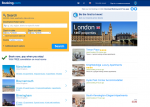 I’ve been using travel sites like Expedia and Hotels.com in my presentations for years. In general, travel sites are some of the best at incorporating persuasive technology. Conversion expert Paul Rouke (@paulrouke) focuses on another travel site in Is Booking.com the most persuasive website in the world? After you read Paul’s analysis, you might answer, “yes!”
 Forms, forms, forms. Every website has one or more, but they are one of the biggest barriers to conversion. How many times have you been ready to request information, download content, or take another action but changed your mind after being confronted with a lengthy or confusing form? Graham Charlton (@gcharlton) offers 21 first class examples of effective web form design as a fount of ideas to get your creative juices flowing.
 Our natural tendency is to offer our customers and visitors more to choose from. But, unless you are Jeff Bezos, that approach may be a mistake. Stefanie Grieser‘s (@smgrieser) looks at how the paradox of choice can affect your site’s performance in Is Too Much Choice Killing Your Conversion Rates? [Case Studies].
 It’s good to look smart, particularly if you are trying to interest others in your project or products. One approach might be to get a pair of thick glasses and mimic Einstein’s hairdo. If you are looking for a simpler way, read Dr. Jeremy Dean’s (@PsyBlog) The Facial Expression That Makes You Appear Smarter. Get smart!
 Ever wonder why you keep misplacing items like your sunglasses? There’s an explanation for these cognitive lapses, says Sumathi Reddy (@rddysum). Reddy explains these common memory lapses at WSJ.com in Why We Keep Losing Our Keys.
 We all know that buttons are visual cues to click, and outperform mere text links, right? That’s Conversion Optimization 101. But, all may not be as it seems. Joanna Wiebe (@copyhackers) describes actual test results in The Day a Text Link Outperformed a Button.
My Stuff
 Your online reputation always precedes you. I review Repped: 30 Days to a Better Online Reputation by Andy Beal. Capsule: Repped is an excellent, practical guide to reputation management for businesses and individuals, divided into 30 discrete chunks.
 Do you have a major case of Google Guilt? Fast Company thinks you might… Spurred by their article, I take a look at the psychology of reputation management and tell you Why You Are a Complete Idiot If You Don’t Google Yourself.
Weird/Wonderful
 Does your local coffee shop look like a caffeinated co-working facility, with lots of people hunched over laptops clattering away? Are YOU one of them? (I often am!) Many coffee shops cater to this crowd, making outlets handy and upgrading their bandwidth. Now, we may be in trouble… Annie Russell‘s (@anniemrussell) No Laptops, No Wi-Fi: How One Cafe Fired Up Sales describes the scary possibility.
Remember, you can add YOUR pick of the week in a comment!
Great collection of links for the long weekend I really like the article on web forms especially having a live chat at the check out of an ecommerce store, when it’s the time you probably have the most questions.
Your picks show that we over-think conversion. It isn’t how you put your call to action buttons, texts or forms. It is mostly where you put them. I remember making a killing with a homemade website about a year ago. The product offer was placed in such a place that it didn’t matter it was lousy and rest of the website sucked.
Also, it is important what sort of traffic you are driving to your website. Are they buyers or school children doing research for their homework?
By the way, I understand the coffee shop conundrum. I used to own a restaurant that was open until early morning. A few people were using it as a place to come after all the bars closed. They have already had enough and just nursing I glass of drink for hours. But we were a restaurant and had no table for people who wanted to eat. What I had to do is to start charging $20 entry fee that would be deducted from your food bill. People who wanted to eat had no problem with it and people who just wanted to sit with one drink disappeared quickly. You have to identify the problem quickly and do something to solve it even it is unconventional.