When Subliminal Logos Attack
In Subliminal Logos, I highlighted a some logos that incorporated elements so subtle that they might not be consciously processed, at least on first viewing. Several Neuromarketing readers pointed me at an interesting Fortune article on logo remakes, What’s In a New Logo?. A few of these remakes were prompted by some subtle, if not subliminal, characteristics that carried the WRONG message to viewers.

Blowing up the Death Star
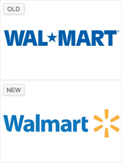
There’s nothing that horrible about Walmart’s old logo – it’s clean and not overly dated in appearance. The problem is the subliminal message sent by the blocky type and bold star. For a small company, a logo with that look might convey a sense of solidity and permanence. On the other hand, for the world’s dominant retailer who is often accused of using its size to get the better of employees, vendors, and communities, the bold logo might carry a subtle message along the lines of, “We will crush you!” Walmart opted for a lighter, more friendly design for their new logo.

The Devil’s in the Details
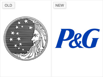
Procter & Gamble kept their old-fashioned Man in the Moon logo into the 1990s. First used in 1851, that logo was definitely out of fashion for many decades before its retirement. Procter & Gamble wouldn’t kill off the moon guy, thought, and even made a few last-minute tweaks around his 140th birthday. Few companies last a century and a half, and P&G likely wanted to use the less than trendy logo to communicate a sense of the company’s stability and longevity to its customers. Sadly, a small subset of P&G customers didn’t see stability and permanence in the logo, but rather found Satan. These fringe-dwellers “discovered” devilish references like 13 stars and, supposedly, various uses of “666” in the beard. Despite the fact that this all happened before Twitter and YouTube, these rumors spread virally and simply wouldn’t die. P&G was unable to convince this small band of critics that the firm’s longevity wasn’t due to satanic connections, and they finally abandoned their logo only a few years before it would have hit a century and a half of continuous use.

Morality Play
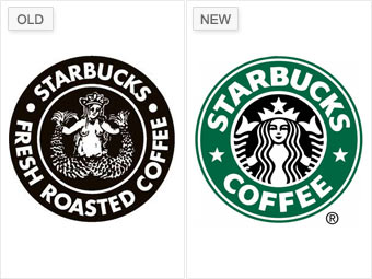
Undoubtedly, the purpose of the original Starbucks logo was to convey the West Coast, funky ambiance of a friendly neighborhood coffee shop. The kind that has a menu written in chalk, and servers with blue spiky hair. That’s all well and good, but for the world’s biggest coffee purveyor, a topless mermaid holding her tailfins open seems a bit, umm, out there… They shelved the seductive mermaid for a sanitized, stylized version back in 1992.
Amazingly, last year Starbucks covered the breasts of the original mermaid and attempted to bring her back. Customers promptly named her “Slutbucks” and forced Starbucks to retreat to their more modest green logo.

More Cool Logos
Looking for some logos that don’t come loaded with a negative message? Neuromarketing reader Jeff Ramos suggested a couple of other interesting compilations of logos. A few may be subliminal, but most of them are just plain clever. Check out Amazing One Element Logos and 15+ Amazingly clever logos for more logo fun.

