
What do mathematicians, architects, logo designers, and neuroscientists have in common? They’re all fascinated by the Golden Ratio—a proportion that has captivated humans for millennia. But does this “divine proportion” really have special power over our brains, or is it mostly myth?
The Golden Ratio (approximately 1.618, also called the Golden Mean, Golden Section, or phi) appears throughout mathematics, nature, and design. You’ll find it in the spiral of a nautilus shell, the proportions of the Parthenon, and—if you believe the claims—in logos from Apple to Twitter. But the most intriguing question for marketers and designers is whether humans have a built-in preference for this proportion.
Brain Scans and the Golden Ratio
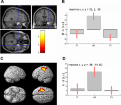 In 2007, Italian neuroscientists Cinzia Di Dio, Emiliano Macaluso, and Giacomo Rizzolatti conducted an elegant experiment. They showed volunteers images of Classical and Renaissance sculptures—masterpieces that embody the Golden Ratio—alongside versions that had been digitally altered to violate those canonical proportions. Using fMRI brain scanning, they tracked which brain regions responded differently.
The results were striking. When participants viewed sculptures with Golden Ratio proportions, their brains showed activation in the anterior insula—a region associated with emotional feelings. This activation was strongest when viewers simply observed the sculptures without any explicit judgment task, suggesting the response was largely automatic and non-conscious.
The researchers also found that when participants actively judged sculptures as “beautiful,” their right amygdala activated—the brain structure involved in emotional memory and learned associations. This suggests that our sense of beauty involves both innate responses to certain proportions and personal emotional associations.
More recent research supports these findings. A 2022 study using eye-tracking found that participants showed a statistically significant preference for Golden Ratio proportions (53% preference rate), with the effect being strongest for images of humans and anthropomorphic sculptures. Interestingly, participants needed less viewing time to judge Golden Ratio stimuli as beautiful, suggesting these proportions may facilitate faster perceptual processing.
![]()
Golden Ratio Skepticism
Before you redesign everything to match 1.618, there’s important context to consider. The scientific picture is more complicated than early Golden Ratio enthusiasts suggested.
A comprehensive 2024 review in Maxillofacial Plastic and Reconstructive Surgery examined the evidence and concluded that “there is no convincing evidence that the golden ratio is linked to idealized human proportions or facial beauty.” The review found that many historical claims about the Golden Ratio—including its supposed use in the Parthenon and Leonardo da Vinci’s work—are not supported by actual measurements.
Stanford mathematician Keith Devlin has been particularly pointed in his criticism. In experiments at Stanford, students asked to pick their favorite rectangles showed no consistent preference for Golden Ratio proportions. Their choices appeared essentially random and varied when they repeated the exercise.
So what’s going on? The brain scan evidence is real, but the effect appears to be:
- Modest: A 53% preference is statistically significant but not overwhelming
- Context-dependent: Stronger for human figures and biological forms than abstract shapes
- One factor among many: Not a universal “beauty formula” that trumps all other design considerations
- Possibly learned: Our exposure to Golden Ratio proportions in art and nature may shape our preferences
The Golden Ratio in Logo Design
Despite the scientific nuance, many designers find the Golden Ratio a useful framework. Several iconic logos are said to incorporate Golden Ratio proportions:
- Twitter/X: The bird was constructed using overlapping circles in Golden Ratio relationships
- Apple: The curves reportedly follow Golden Ratio circle proportions
- National Geographic: The iconic yellow rectangle is a Golden Rectangle
- Pepsi: Circle relationships follow Golden Ratio principles
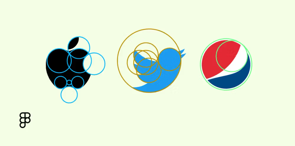
Whether these proportions cause these logos to be memorable, or whether talented designers simply used the Golden Ratio as one tool among many, is hard to say. But the framework clearly provides a systematic approach to achieving visual harmony.
Practical Implications for Marketers
So should you apply the Golden Ratio to your designs? The brain science suggests a measured approach:
Use it as a starting framework, not a rigid rule. The Golden Ratio provides a mathematically grounded approach to proportion that can create visual harmony. It’s a reasonable default when you don’t have other constraints.
Consider the context. The brain evidence is strongest for human figures and organic forms. For abstract shapes or typography, other design principles may matter more.
Don’t force it. If your subject matter, available space, or brand requirements suggest different proportions, those considerations may be more important than adhering to 1.618.
Test your designs. As with any design principle, real-world testing trumps theory. A/B test different proportions if the stakes are high enough to warrant it.
Neuromarketing Takeaway
The Golden Ratio isn’t the universal “beauty formula” some have claimed, but it’s not pure myth either. Brain scan evidence shows our brains do respond differently to these proportions, activating emotion-related regions. The effect is real but modest, context-dependent, and just one factor among many that influence aesthetic preference.
For designers and marketers, the Golden Ratio remains a useful tool in the toolkit—a systematic framework for achieving visual balance. Just don’t expect it to be magic. As with most things in neuromarketing, the research provides a starting point, but it’s important to test, test, test.
Published December 27, 2025. This is a revised and expanded version of an earlier post.