When Fancy Fonts Work

Now that you followed my advice in Convince With Simple Fonts and eliminated complicated fonts from your websites and printed material, I’m going to tell you that there is one situation where fancy, hard to read fonts can actually work better than simple ones. If you are selling a costly product, describing it using a hard to read font will suggest to the viewer that more effort went into creating that product. As part of their ongoing cognitive fluency research, Hyunjin Song and Norbert Schwarz of the University of Michigan found that restaurant menus are one such case.
In the same study I discussed in the “simple font” post mentioned above, If It’s Hard to Read, It’s Hard to Do – Processing Fluency Affects Effort Prediction and Motivation, Song and Schwarz presented test subjects with a description of a menu item printed in either a simple font and a more hard to read font. The subjects who saw the difficult font rated the skills needed by the chef significantly higher than the subjects who saw the simple font.
Restaurant Menu Lessons
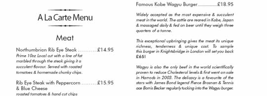
These findings suggest that a restaurant wanting to justify higher prices could print the menu descriptions in a font which is harder to read. In addition, other steps that affect the cognitive fluency characteristics of the description could amplify the effect of the fancy font. Long descriptions with big words will also slow down the reader and imply that more effort and skill is needed to prepare the dish. The menu snippet in the illustration exploits several of these characteristics, employing mixed fonts and and unusually long descriptive text.
Of course, it is logical that the content itself should also suggest the skill and time needed to prepare the dish. As with most marketing efforts, best results occur when all the elements are in sync. Other steps to use a restaurant’s menu to boost sales are described in Neuro-Menus and Restaurant Psychology.
Beyond Restaurants
There’s a Neuromarketing takeaway here for all kinds of businesses: complicated fonts make things seem more difficult. If you want to convince customers that your product involves tedious steps to make, or that great skill is required to deliver the service you provide, slow the reader down with harder to read text and big words.
One Big Caution
To me, the danger in trying to exploit cognitive fluency using fancy fonts and complicated text is that your potential customers won’t be motivated enough to struggle through it. Restaurant customers are likely to read the descriptions because they have no choice if they want to order food and know what they will get. Customers looking at a product brochure or a print ad might simply skip the text altogether. Could a lingering sense of complexity still remain, even from a brief glance? Perhaps. But I’d recommend using this approach sparingly – overdo it and you might lose the customer’s attention completely.
