As consumers, we love more pictures of products we’re interested in.
Close-ups, multiple angles, etc. ensure we know what we’re buying. One person might buy a running shoe for its stylish appearance, but another might be most interested in its sole design. Yet another might want to examine the lacing or ventilation.
One could easily conclude that more product images are always better. That would be wrong.
In fact, a Stanford study shows that adding more images can actually reduce the desirability of products.
 Not long ago, guest author Liraz Margalit explained how adding product specifications and descriptive information on the main product page reduced sales in some cases. (See How the TMI Effect Cuts Your Sales, and 4 Ways to Avoid It.)
In that article, “TMI” stood for Too Much Information. (For non-US readers, the TMI acronym has turned into a popular colloquial abbreviation, usually invoked when someone is telling a story with unappealing details.)
The research suggests that in this context, TMI might also stand for “Too Many Images.”
Gestalt vs. Component Processing
The reason for both TMI effects is related, though not identical.
Showing consumers long descriptions and wordy specifications is thought to change their decision-making from a more emotional process to a more rational one. This, in turn, causes the consumer to compare pluses and minuses, think about alternative products, consider negative outcomes, and, perhaps, end up making no decision at all.
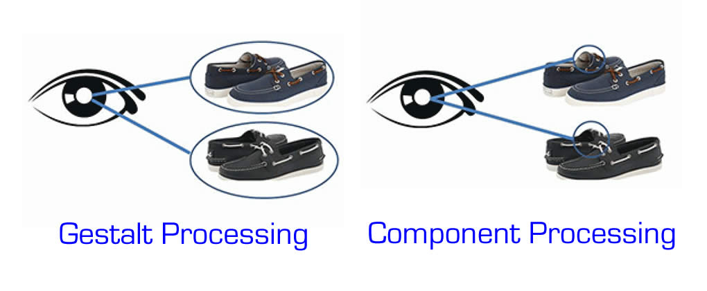
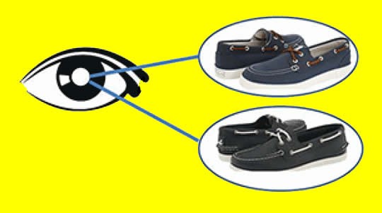
For images, the way our brains process “big picture” vs. detail views are called “gestalt” and “component” processing. When we process how a shoe looks, we’re in gestalt visual processing. When we study the detail of how it laces, we’re in component mode.
Including more images and views, then, tends to push consumers into component visual processing. This, in turn, makes products seem confusingly similar by reducing the importance of the overall appearance.
As reported by Stanford Business Insights, researcher Baba Shiv noted,
Seeing multiple pictures of two products may make both less attractive. #ecommerce #CRO Share on XSeeing multiple views did not make one product seem more attractive than the other. It made them both less attractive.
Product Agnosia
The scientists describe the phenomenon as “product agnosia,” a term based on the Greek word for “not knowing.” New information gained from viewing additional pictures tends to cause the viewer to forget the original product differences.
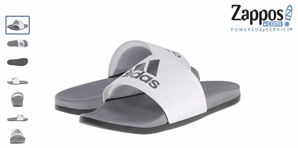
Here’s an example from Zappos.com. While the company is amazingly successful, do you think that the plethora of product images available to inspect give significantly more information to the consumer than the main product shot?
Some products don’t suffer from the product agnosia effect. Products with important performance details, like mobile phones, are one such product. In these cases, looking at the details can sharpen product differentiation.
The product page for a Blackberry Passport from AT&T has many views of the product, four videos, and many screens of additional information accessed by scrolling down:
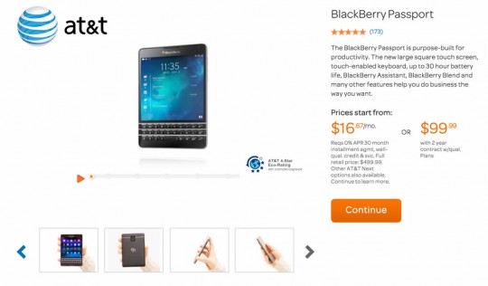
This seems like a lot of information, but for a product in this category, particularly one that isn’t brand-driven like the newest iPhone, it may be just what the consumer needs.
Marketing Implications
So what’s a marketer to do?
The authors suggest delaying the purchase to allow the customer to get back into gestalt mode. For example, the customer could be encouraged to place the item into a shopping cart and then complete the purchase later.
My concern with a delayed purchase is that it may never happen.
Trillions of dollars worth of merchandise are abandoned in ecommerce shopping carts every year. While retargeting and other techniques can prevent a few of these losses, I think deliberately delaying order completion is a risky strategy.
Here’s what I recommend based on Shiv’s and other research:
First, if you have a product that does indeed have important feature differences and design details that customers need to examine, go ahead and include multiple images. They may help close the sale.
Second, if your product is simple in concept, like a fashion item, consider a single, high-quality image. This may not always work – I suspect few women would buy a bathing suit without seeing both front and rear views. But even in those cases, providing the minimum number of images necessary will likely work better than a larger number of views and close-ups.
Third, consider a compromise strategy. If you think some, but not most, customers will want to see a variety of product images, put them behind a clickable tab. This is the same strategy recommended in the product information TMI article.
By putting the extra images behind a tab, or perhaps in a popup accessed by a link, they don’t distract the buyer driven by brand, emotion, and other non-conscious factors. The buyer who is concerned about details and features, on the other hand, will be able to easily find the images to continue the evaluation process.
If you do use detail images, consider labeling them with key differentiators. For example, if your briefcase carry strap attachment is double-stitched and riveted for durability, say so in a label. Instead of becoming homogenized with competitor product images, your image will stand out.
If you aren’t certain how your customers are making their decisions, testing the conversion rate with one image vs. multiple images would be relatively simple.
Don’t trust your instinct
when we’re excited about a product, our natural tendency is to show it off. We include pictures from every angle showing every amazing detail. We describe the features, benefits, and specifications as completely as we can.
Before committing to that approach, though, keep the TMI effects in mind. Simpler is often better, and less distracting content can result in more sales.
Beware the TMI Effect - adding pictures can reduce sales. #ecommerce #CRO Share on XRelated: How the TMI Effect Cuts Your Sales, and 4 Ways to Avoid It.