Gestalt psychology is a visual perception theory – developed by German psychologists in the early 1920s – that tries to explain the way our minds navigate the chaotic world to make meaningful conclusions. The word “gestalt” itself means “unified whole,” a phrase that perfectly captures how we perceive, process, and piece together fragmented parts.
A major misconception of Gestalt principles goes back to an incorrect English translation: “the whole is greater than the sum of its parts.”
But in truth, the essence of Gestalt is that “the whole is other than the sum of its parts.” This essence here implies our perception of the whole can be created independently of its parts. Or in other words, putting together something as a whole can help it take on a new dimension of its own.
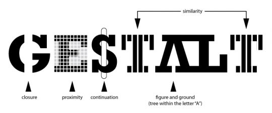
Gestalt principles: proximity, similarity, closure, continuity, and Prägnanz (figure-ground).
For visual marketers, this is great news.
Because as wonderful as the human mind is, it doesn’t reliably use logic when it comes to visual perception. Optical illusions are just one example of this.
5 Ways Using Gestalt Principles Can Improve Your Visual Marketing Share on X
And humans don’t actually make their decisions on their own – instead, they are subject to internal biases, external pressures, and a host of other factors. This means that having an understanding of how humans react to visual stimuli can be very beneficial; not only will you be able to deliver your visual message with greater efficiency, but knowing Gestalt psychology gives you room to be creative as well.
So, let’s take a look at how the five Gestalt principles above influence visual perception and what you can do to apply the principles to your visual marketing.
Law of Proximity
The Law of proximity says that we subconsciously perceive objects that are close to one another as within the same group. Since our brains seek continuity, this subconscious grouping lets your brain create a clear interpretation of the relationship between objects.
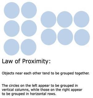
Image source
Marketers and advertisers can also use the Law of Proximity to deliver a memorable and eye-catching visual message, just like Prada did in this print ad below. By arranging different elements close to one another at an equal distance apart, a clear pattern forms for a striking visual impact.
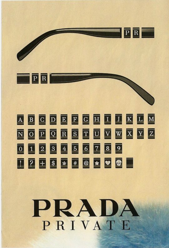
Image source
Law of Similarity
The Law of Similarity says that our brains perceive objects with common elements as belonging to each other, whether the“common elements” here are shape, color, size, texture, or any other visual element.
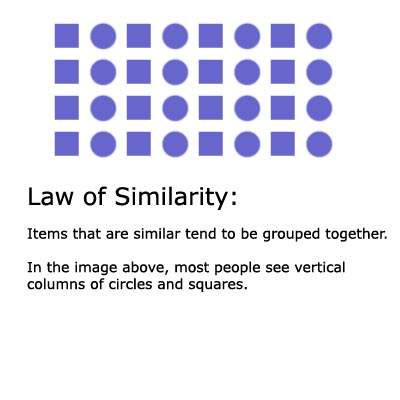
Image source
As far as web content goes, the Law of Similarity is useful when you need to organize dissimilar objects – such as images and texts of different sizes – into a group. One way to create a visual unity of dissimilar objects is to apply a common characteristic to them, such as the same background color.

Image source
In the above eBay homepage, images and text of various sizes appear to belong to the same group because of the common green color. This helps consumers link items together for faster and easier processing.
Another way to apply the Law of Similarity is to break it. If you want to draw attention to a particular element, make sure its design breaks away from the rest of the page. The CTA below is a perfect example of this. Since the red CTA button stands out from the uniform blue color of the page, it’s impossible for readers to miss.

Use the 'Law of Similarity' to improve your visuals. Or break it to grab attention! Share on X
Law of Closure
This law tells us that our brains usually associate disconnected elements with forms we already know. This means that our brains also tend to complete missing links without being asked to, though we must first be familiar enough with the implied shape for this to happen.
The image below is a great example of this. With a quick look at the image, your mind instantly fills in the missing parts with two shapes that you already know: circles and triangles.
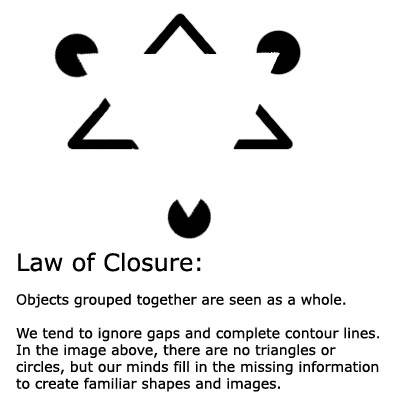
Image source: Pinterest
You’ll find the Law of Closure in the innovative logos of several famous companies, such as WWF or Apple. When we see a logo like the WWF one below, our minds fill in the gap to recognize the panda as a whole, even if many of the lines aren’t actulally there.
Visual marketers can also use the Law of Closure themselves to create more engaging and memorable content.

WWF and Apple logos are great examples of the Law of Closure. Image source: Pinterest
Law of Closure: Let your customer's brain finish your imagery! Share on X
Law of Continuity
The Law of Continuity explains how our eyes search for continuous forms and follow smooth paths. This means we prefer to interpret visual information as connected instead of disconnected. As an example, if we look at the image below, we’ll be inclined to see the disjointed dots as running in a smooth, curved line.
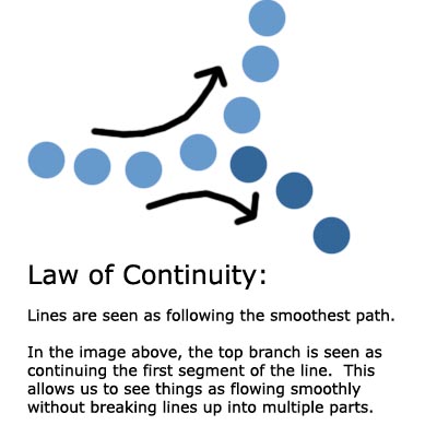
Image source
Because of our brains’ tendency to see lines in an established direction, the Law of Continuity is sometimes used in logos where broken lines form a continuous shape. In the example of the IBM logo below, the Law of Continuity makes the logo appealing to look at and easy to read despite the gaps.

Image source: Pinterest
Law of Figure/Ground
The Law of Figure/Ground shows how our minds find a visual focus by separating figure from the background. The “figure,” also called “positive shape,” is the part of a composition that we pay attention to.
This law explains that the “figure” emerges as the part of a visual element that takes us the least cognitive effort to process. In other words, it’s the part that jumps out to us the most. The rest of the visual element would be then be considered the “ground.”
There are 3 types of figure/ground relationships. Depending on your goal, all three of them create opportunities for effective visual communication.
In a stable figure-ground relationship, the figure can be clearly distinguished from the ground.
In an ambiguous figure-ground relationship, no part of the image stands out as either the figure or the ground.
In a reversible figure-ground relationship, both the figure and the ground will have an equal weight in the image. This means that our eye can “flip” the figure and the ground, such as in Rubin’s Vase below.
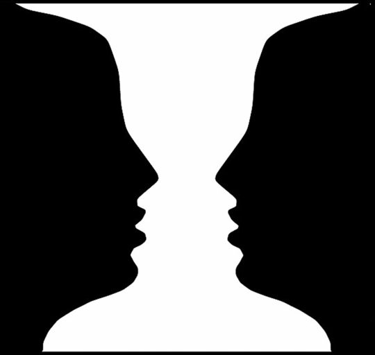
Rubin’s Vase demonstrates how a “reversible” figure-ground relationship works. Image source ibitimes.co.uk
For visual marketers, the most common figure-ground relationship is the stable type. You can use space and contrast to create a stable figure/ground relationship in your content that easily draws attention to your desired focal point.
The iPhone 7 homepage below is a very clear example of a stable figure/ground relationship.
On this page, the strong contrast between the white header text and the black background makes the text really pop out. Even the product itself almost blends into the background, making it impossible for the white text not to emerge obviously as the figure.
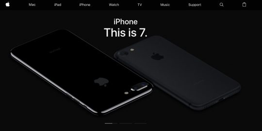
Apple’s homepage design for iPhone 7. Image source: Apple.com
Conclusion
Over the years, Gestalt theories and psychology have helped many professionals, including marketers and advertisers, understand how their audiences interpret visual information and make sense of the world.
The value of Gestalt principles lies in their power to help us create truly appealing content that drives engagement and inspires action based on our how our audience’s brains perceive info. In other words, it’s definitely worth learning how to engineer our content based on 1 or more of these principles.
And if you are hungry for more knowledge on the psychology of visual communication, check out these great articles on subliminal messages or visual storytelling rules.
If you’ve tried to apply any of these Gestalt principles, please share your thoughts and experiences with us in a comment!
5 Ways Using Gestalt Principles Can Improve Your Visual #Marketing. Share on X