Do you have a website redesign planned? If so, there might be a lesson in my first experience with a Schindler ID System elevator control installation.
When passenger elevators first came into use, they were complicated and a bit dangerous. They were often operated by employees of the building owner lest passengers get caught in the door or stuck between floors. Eventually, automation took over, and today we all know how to get from one floor to another without devoting any thought to the process. I’ve been in countless elevators in many countries, and despite great differences in cultures and language, elevators function in a transparent and identical way. That is, until I encountered a hotel featured the Schindler system that offers a very different elevator experience.
Here’s how the architect designed the ideal elevator process. The elevators are arranged in a circle around a little lobby – very attractive and ultra-modern. To get inside the elevator lobby from a guest floor, though, I have to get through a heavy glass door. It’s locked. Maybe to prevent a cat burglar who rappelled to the 28th floor, broke in through a window, and now planned to make a quick exit via the elevator? I wave my RFID room key at various objects to no effect. Finally, I notice on the wall opposite the door handle there’s a button that says “unlock door.” I push it, and quickly open the door. (I guess the cat burglar could have pushed the button too. Hmmm. Maybe its purpose is to keep really short people away from the elevators?)
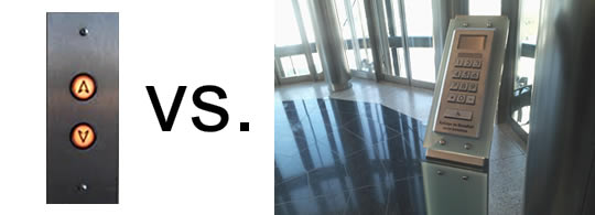
The elevator lobby has none of the traditional “up” or “down” buttons. Rather, there’s a little kiosk with a keypad and a display. To use the keypad, though, you have to swipe your room key next to a sensor. But where’s the sensor? There’s no label, nothing to indicate which spot you have to get close to – I figured it out by watching a bellhop do it. There’s no beep or other feedback when you identify yourself to the elevator brain – you know it worked only if you can use the keypad.
Once the elevator brain decides you have authorization to request an elevator, you key in the number of your destination floor. The display gives you a letter code for your assigned elevator. When you enter the car, you find no floor buttons at all. Your pre-selected floor is displayed on a little panel by the door. Don’t even think about, say, stopping at the reception floor once you’ve boarded – you made your decision at the kiosk, and any itinerary changes will have to wait until arrive at your programmed destination.
Oddly, even exiting the elevator lobby requires a key card. Since activating the kiosk requires one too, if you somehow got into the lobby without a card (say, if you went in as someone was leaving), you’d apparently be trapped.
I’m sure a lot of thought went into this concept. It’s been installed in quite a number of high-rise hotels, and by all accounts has the ability to transport more people in fewer trips. Why have multiple elevators stop at the 25th floor if you can assign all the passengers for that floor to Elevator D? And just think, no annoying kid will ever run his hand down all the buttons as he exits the car, forcing you to stop at every floor.
The problem is that this system, as efficient as it is, befuddles first-time users. There is no intuitive way to figure out what you are supposed to do, and the process resembles no familiar elevator system. Minimal labeling adds to the confusion. Even if you intuited that you had to key in your floor, waving your key card at an unmarked spot would be a far from obvious step. New arrivals struggle with the setup every time. They have difficulty not because the concept is bad, but because an operation that they have performed unconsciously for many years now has different steps involved.
I found this hilarious video posted by the Sheraton New Orleans to explain how their variant of this system works. (It’s similar, but lacks all of the RFID security and locked-door access control that added to the complexity of my hotel’s system.) If you feel the need to create a how-to video for your elevators, do you think there might be a usability issue?
Web Designers, Pay Attention!
When a visitor comes to your website, they bring with them a knowledge of how websites typically work. If they are returning visitors, they know how yours works. When you change the user interface in some way, even with good justification for doing so, you force them to learn something new. While they may indeed get used to it, the consequences of the change could be disastrous in the meantime.
At one conference I spoke at, I met a conversion optimization expert who was asked to redesign a site’s navigation to increase traffic to one part of the site. Noting that the link was buried in a fairly inconspicuous location, he initiated a test where it was moved to a much more prominent location near the site’s logo. The test results were shocking – the target section saw a drop in traffic of nearly 90% with the link in the new location. The test was halted after a few hours.
My guess is that the drop in traffic wasn’t because of the new location being inherently bad, but rather that regular users knew where the link was and, unable to find it, moved on to something else rather than hunting for it.
“Don’t Make Me…”
Steve Krug’s classic web design guide, Don’t Make Me Think, could have helped the designers of that elevator system. They took a device that required no thought and turned it into a puzzle for first-time users.
Krug is big on usability testing, and he says you can spot big problems quickly with just a few subjects. Even a few minutes of usability testing will show which elements of your site design spark confusion. Things that are totally obvious to you may not be nearly as apparent to inexperienced users. The good news for web designers is that it’s a lot easier to test a website than a bank of high-speed elevators!
So, when you make changes to your website, don’t let design creativity trump user experience. Don’t violate traditional norms for placement of important elements and content, and, if you have repeat visitors, be vary careful about making them re-learn how to use your site. Not everyone will make the effort!
If you must deviate from your past navigation and content placement, be sure you provide obvious visual cues for first-time as well as returning visitors. A little more signage would have enabled even a brand-new guest to use these elevators without a struggle.
While hotel guests have no choice but to figure out the elevator system if they wish to get out of the building, for confused web visitors escape is as convenient as the “back” button. And, the back button is one that just about everybody uses without having to think!