How Top Conversion Experts Seduce You Into Giving Up Your Email

16

These days, almost every website wants your email address. It might be for a newsletter, for blog updates, or special offers… whatever the reason, these site owners know that a good email list is a critically important business asset.

But, how do you get visitors to subscribe? In these days of overstuffed inboxes, there’s surprising resistance to giving up one’s email. So, we looked to the top conversion experts in the world to find their secrets for turning casual visitors into subscribers.

Why pick these sites? It’s simple: these conversion pros have at their disposal all of the tools for testing alternative designs and techniques, along with (in most cases) years of experience in optimizing other people’s sites. Most have conducted hundreds or thousands of tests for both clients and their own sites, and have a great sense for what works in a given situation. So, let’s check in with the experts:

Bryan and Jeffrey Eisenberg

The Eisenbergs were talking about conversion long before it was fashionable, and their approach to subscriptions is state of the art. The duo’s branding focuses on Bryan, and BryanEisenberg.com starts with a massive title and an image of Bryan gazing directly at the visitor:
bryan-eisenberg-site
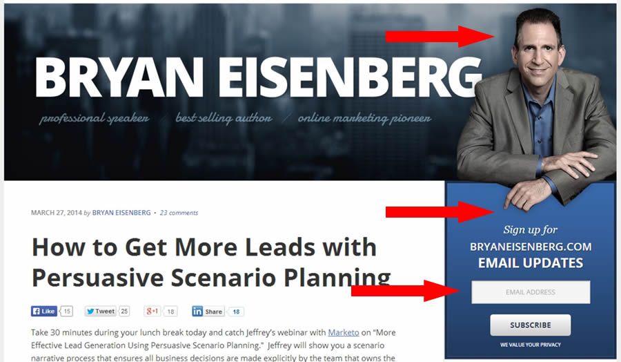
The call to action for subscriptions is a simple but prominent box just below the header. It asks just for an email address. A subtle but clever element is the positioning of Bryan’s image. It overlaps the subscription box to draw the eye into it and offers another visual nudge: his left hand’s index finger is pointing to the box.

The next nudge to subscribe comes in the form of an exit-intent driven light-box popup:
bryan-eisenberg-exit
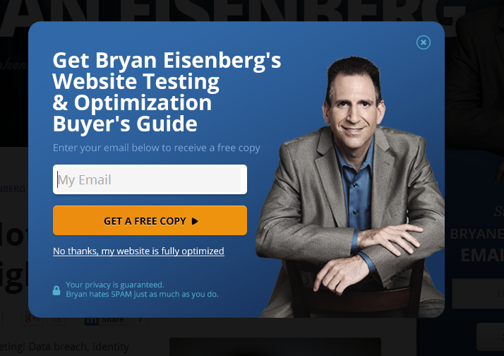
This popup matches the style of the site, complete with the same image, but varies the offer. In this case, a free buyer’s guide is offered. A nice touch is the link to close the popup, which reads, “No, my website is fully optimized.”

Crazy Egg Blog

Crazy Egg and founder Neil Patel understand visitor behavior – after all, Crazy Egg is a heat-map tool used by conversion experts to study how visitors interact with websites. They take one of the more unique approaches to getting you to subscribe to their blog. Converting at the Crazy Egg Blog starts off simply – the top of the page has an easy-to-miss subscription form just below another call to action for their heat map tool:
crazy-egg-blog-900
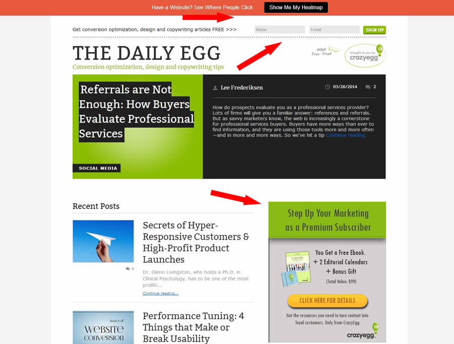
There’s also a fairly conventional sidebar ad for subscriptions, this one featuring a “Click Here for Details” button instead of a form. And, this ad includes some free items as inducements to subscribe.

Click that button, and Crazy Egg’s approach gets interesting. Instead of taking the visitor to a simple form with minimal text, it leads to a full-blown sales page describing at length both the free downloads and the benefits of becoming a “premium” subscriber (a “$99 value!”).

crazy-egg-sub-page

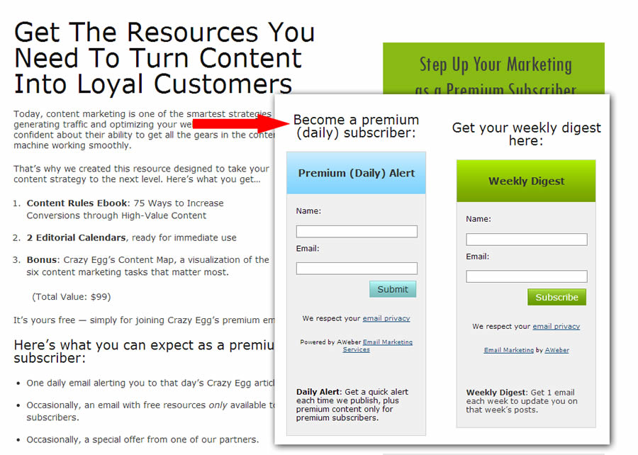
Premium subscribers get daily updates and the bonus items. The page also offers a weekly option without the bonus items.

crazy-egg-popup
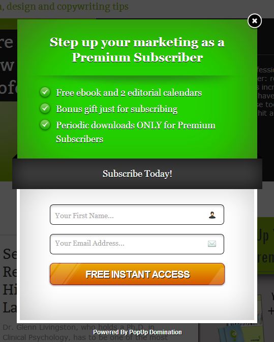
Why go through all this for a subscription? My take is that it explicitly gets visitors to sign up for and expect daily updates. This is far higher frequency than most blogs, but having a list of opt-in daily subscribers is a big advantage for Crazy Egg. They can promote their own products, of course, but also have plenty of opportunities for advertising and affiliate offers.

The process Crazy Egg uses to sign up subs may cut their initial conversion rate a bit but it also reduces quick unsubscribes or, even worse, unhappy subscribers flagging the daily esmail as spam. (It’s possible, too, that the lengthy copy, though unusual for a free subscription, actually increases conversion.)

And, unsurprisingly, there’s also a timed lightbox popup. The popup, like the header nudge, allows visitors to enter their name and email directly.

There’s a lot going on at Crazy Egg – their main website is focused on converting heat map trials, so there’s entirely different set of nudges there.

Peep Laja and Conversion XL

When you arrive at ConversionXL.com, you can’t miss the nudge to subscribe. Why? Because it’s the ONLY thing you see:
conversionxl-home
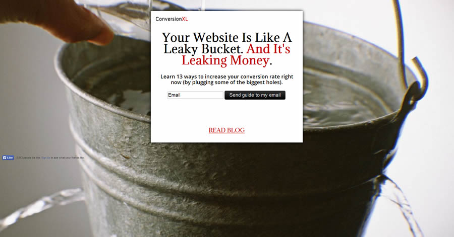
Actually, the offer doesn’t emphasize the subscription – the copy describes a free download, which, as the confirmation email clarifies, also includes subscribing to the mailing list.

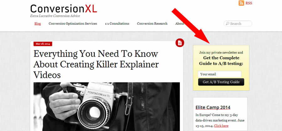
Assuming you weren’t persuaded by that full-screen pitch, there’s more in store. Blog pages all have a simple but prominent call to download (and subscribe) at the top of the sidebar:
conversionxl-sidebar1

But wait, there’s more! Scroll down to read more content, and as the top box disappears, a small slide popup appears at the bottom of the sidebar to take its place. It’s not intrusive and doesn’t block the content.
conversionxl-side-low
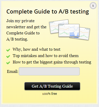
This box does offer more reasons to subscribe than the box at the top.

If you have been able to resist Peep’s charms so far, there’s one more opportunity for you to connect. Triggered either by time or apparent exit intent, a huge overlay makes sure you really don’t want to subscribe.
conversionxl-popup
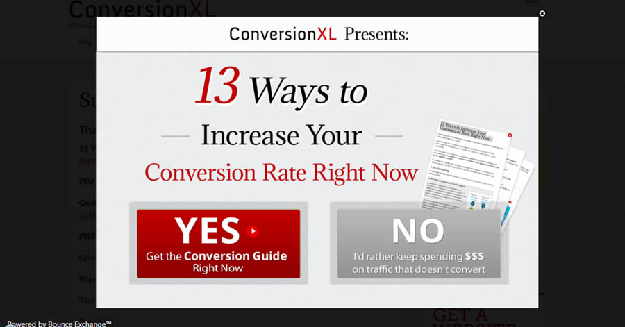
The “No” button is the same size as the “Yes” button but is visually de-emphasized so that it blends into the background. We observed several versions of this popup, and to decline this one you click a button that says, “No, I’d rather keep spending $$$ on traffic that doesn’t convert.” Who’s going to agree with that?

Get More, Free!

secrets-croIf you like these real-world expert examples, you can get more free in my 40-page ebook, List-Building Secrets of the World’s Top Conversion Experts. How? For a limited time, we’re offering this ebook free to anyone who joins the 30,000-plus subscribers to my Neuromarketing updates. (Existing Neuromarketing subscribers have already received the download link.)

In the ebook, we look at a dozen sites in total, exposing and analyzing the tools these experts use to build their lists. Experts include masters of online persuasion like Chris Goward, Noah Kagan, Brian Massey, Nathalie Nahai, Rich Page, and more!

Grab the ebook for free, while you still can! Enter your email address in the form below (yes, this is my approach to seduction!), and learn by example from the best in the world!

16 Comments
  1. Kathryn Aragon says

    Hi Roger. Thanks for the Crazy Egg mention and your astute evaluation of our subscription process. Thought you’d be interested to know that adding the long-form sales page has helped, not hurt, subscriptions. In one year, we matched the growth of the previous 2-1/2 years, and we nearly tripled subscriptions. Better still, we get a lot fewer unsubscribes.

    1. Jeff Howell says

      Hey Roger – that’s a great post.
      As you already noted, I believe popups are one of more effective ways of lead generation. I also think it’s very important to mention the 2-step popups, as they prove to be much more effective later on as they required a micro-commitment before user subscribes. At Exit Mist we created a tool, which allows far better customization of popup designs (on the same level as with Bounce Exchange) with ability for 2-step popups:
      http://exitmist.com

  2. Roger Dooley says

    Thanks for that info, Kathryn. I was certain the approach would reduce your unsubs, but it’s awesome that it increased the base conversion rate.

    I guess that’s why testing is so important – what you think will work best doesn’t always perform that way! “Best practices” aren’t always best…

  3. Jeremy Smith says

    Hey Roger, great post. I am actually in the works of something very similar with exit strategies (pop ups) of these major players (like yourself) as well as some others. My favorite thing here is Peep’s No button and the copy on it as well. It makes me chuckle every time I see it. From a user perspective, I can only imagine it’s very convincing and leads to many conversions.

    Bryan’s picture with his hand/finger pointing in the general direction of the conversion has always been a favorite of mine. Being a consultant myself, you are the brand and he does a fantastic job with font size and type of his name, a picture for recognition as well as making it very easy for your eyes to follow down a specific path.

    I have found most success using a scrolling pop up and get tons of people to download a resource guide specific to the content they are reading. I am right in the middle of also implementing a site wide pop up after a certain time on site, or upon site exit or both. Be confident that I will be testing all sorts of techniques here.

    1. Roger Dooley says

      Great points, Jeremy. The amusing “No” buttons are becoming more common. I haven’t see one that says, “No, I’m a complete moron who doesn’t deserve to get your awesome info,” but I’m sure it’s out there!

      If I do a Version 2.0 of this, I’ll have to add your site with its latest bells & whistles!

  4. Angus Lynch says

    Hey Roger,

    Thanks for the post. I think one of the reasons exit-intent popups (overlays) work so well is that they use a form of “pattern interrupt” that’s been used by salespeople for a long time. They also don’t disrupt the user experience for people who are still actively browsed the site, or have already subscribed.

    I think another reason is that they limit “decision fatigue” by greying out the rest of the site, and making the decision very simple: yes or no.

    As for the patronizing messaging, ConversionXL wrote a very interesting post on how effective this can be (though I agree it’s quite insulting) http://conversionxl.com/popup-defense/?hvid=2wHc7q#/

    Full disclosure, we’ve recently launched a new exit-intent technology at http://getrooster.com

  5. Farooq Marwat says

    It’s really helpful article. Will sure to apply this on my blog
    Thanks Roger

  6. Samuel says

    Yeah this article is a really good article. I don’t think many people are aware why they are putting in their information. But it is in the favor of the person trying to generate the lead. Unless the reader really believes that the information can help dramatically.

  7. Fer Florez - @FlorezFer says

    Great post Roger. I’m currently working on LanderApp’s blog redesign and these tips are really helpful. Quick question, is there a way to avoid showing pop ups to visitors who already subscribed? It happened to me to visit blogs coming from email campaigns and finding the same pop up asking to subscribe again… Thanks!

    1. Roger Dooley says

      Good point, Fer. Most of the popup plugins can’t tell who is an existing subscriber, since that info is in a database someplace else. Rather, the plugins tend to rely on not showing people the popup very often. Setting a 10 or 20 day delay ensures repeat visitors and existing subs don’t get hammered with ads on every visit. Of course, it would be nice to show non-subs the ad a bit more often. It wouldn’t be difficult to set a persistent cookie for subs and check it before showing the popup, but it’s challenging since most content sites don’t require a login or any kind of authentication. If someone subscribed 4 years ago, and returns to the site now, there’s no way of knowing that’s the same person.

      Forum sites and other sites that use logins can do a much better job of targeting visitors by their subscription status. Maybe some other readers have thoughts on this…

  8. Luke Boobyer says

    Good read. I have to say I really hate it when sites use pop up boxes to try and me to convert. What really grinds my gears though is when they have options like those featured on the Conversion XL popup: “Yes get the conversion guide right now” or “No I’d rather keep spending £££ on traffic that doesn’t convert”. I’m not sure what you would call these type of options but to me it comes across as if they are taking a dig at their visitors. It kind of makes me want to never use their services regardless of how good they are because these options are so irritating.

    1. Roger Dooley says

      Thanks for dropping by, Luke. Some people are turned off by popups, and that’s a risk of using them. The real proof is in the test results: do you get more subscribers with or without them. The data from Peep suggests that there is a net benefit from using well-designed popups.

      The other aspect of the “forced choice,” where the negative option implies “I’m dumb” or “I don’t care,” is interesting. My guess is that testing shows these convert better, too.

      The question A/B subscriber testing doesn’t answer a deeper question… if the real objective is to get clients (for, say, CRO services), what’s the impact? Optimizing for conversion at the subscription stage could, perhaps, not be optimal for the conversion-to-client step. In the absence of specific data, though, I’d say if you can double the number of new subs you’ll have a good chance of getting more clients, too.

      1. Luke Boobyer says

        I imagine it’s a difficult one to test. There must be a net benefit in using forced choice pop ups that use a negative option that implies the visitor is stupid or they don’t care. However I don’t believe I have come across a study that looks at these type of pop up options so it’s hard to tell really. On the one hand you might get more sign ups initially, but at the same time you damage your brand in the eyes of certain visitors and you also turn off some users who were considering signing up at some point but now will choose to use a different service.

  9. Vineet kumar says

    Very nice Article Roger. I also hate it when sites use pop up boxes. Thanks for mentioning about Egg blog, egg Blog is the free php & mysql blog software package, which allows us to create our own online website, journal or blog using your own web-space.
    popups are something because of which i never want to use their services , because these popups are very annoying.

    Thanks Roger for sharing this informative post with us.
    Good work, keep it up.

  10. thinkdisruptive says

    It’s interesting to me that most of the comments are from those providing tech for the pop ups or marketers who employ them. I guess that’s who frequents your site the most, and there’s a strong bit of echo chamber confirmation bias going on.

    I can tell you assuredly, almost everyone hates these. Some, like me, refuse to do business with sites that do this, and after I’ve gotten what I came for, I never return (and delete all the cookies that were left behind). Often, as soon as a popup appears, I leave the site.

    Whether they increase conversions or not, I think you have to ask at what expense. It’s never a good idea to piss off people who you wish to do business with, and it’s my belief that if people want to be subscribed or get marketing crap from you, they’ll sign up and ask for it without all the badgering and insulting interventions. And, assuming people do sign up after this kind of coercive process, how long do they stay subscribed, or actually look at your material before sending it to junk mail automatically? Unless your data includes opens, time spent and click through rates, and you can show all those being positive and not rapidly degrading, I think it may be a false metric to look only at short-term conversions.

    I used to enjoy browsing and shopping online. Pages were quick to load, usually informative, and getting what you needed was efficient. Now, it can easily take twice as long to find anything of value as pop-ups and extreme use of flash and scripts slow sites down to a crawl (even on a 50mbps connection). Marketers are killing the goose that laid the golden egg.

    This is actually a tragedy of the commons case study in the making. If one or two sites use this tactic, many go along with it willingly. When everyone does it, users get angry and harder to sell to, and enjoy the non-intrusive and non-interruptive sites even more.

    My advice: use this tactic at your peril.

    1. Roger Dooley says

      I think part of the problem is in the way sites use these more intrusive ads. Most of the conversion experts use cookies to ensure that visitors don’t keep getting hit by popups, even if they return a day or a week later. Some use exit-intent popups that are less likely to be triggered. This contrasts with some ad-driven sites, who try to maximize ad impressions and clicks with a constant stream of popups and other in-your-face ads.

Leave A Reply

Your email address will not be published.