
Can the font used for important medical instructions affect how well patients follow them?
The answer probably won’t surprise regular Neuromarketing readers. A study at the University of Manchester and Leeds Beckett University found that the font used to present medical instructions did indeed affect how those instructions were perceived. The scientists found,
• Font influenced pregnant women’s perceptions of an antenatal intervention.
• The easier the font was to read, the less complex the intervention was perceived.
• The font of written information may also determine adherence to interventions.
According to the lead researcher, Dr. Andrew Manley, “When it comes to people engaging with written information related to their health and wellbeing, it is vital that it is presented in the most accessible format.”
Study: Some type fonts made patients less likely to follow medical instructions. Click To TweetWhat’s Going On?
Why would something as apparently irrelevant as a type font change people’s beliefs about important medical instructions? The culprit is cognitive fluency.
When our brains have difficulty processing something, that unconscious extra work can be “transferred” to something else and make that task seem more complicated or time-consuming.
In the new study, when the patient instructions were presented in a “disfluent” (harder to read) font, the described activities themselves seemed more complex and difficult. The text, of course, was identical – it was purely the font that made the program seem more difficult.
Bad Fonts Can Kill Your Marketing, Too
If patients getting important medical information are affected by the fonts used to present the information, it should be no surprise that similar effects are evident in many other domains.
In Convince with Simple Fonts, I describe research that shows people estimated it would take twice as long to perform a simple set of exercises when the two-sentence description was printed in Brushy (a rather fancy font) rather than Arial ( a simple, sans-serif font).

Choosing the wrong fonts can add invisible friction to your marketing.
The font that your graphic designer picked may look great and differentiate your marketing from that of other brands, but it may also make it seem more difficult to place an order or request information.
When you are trying to get a web visitor (or reader, etc.) to take some action, “difficult” is the opposite of what you are striving for. If you ask a visitor to complete a short form, for example, showing the instructions in a fancier font will make that task seem (unconsciously, of course) more difficult. Your conversion rate will be lower.
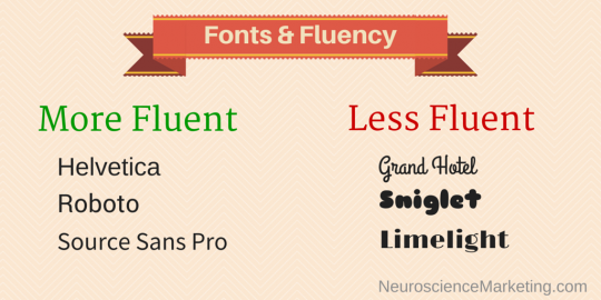
Which fonts to avoid? I’ve never seen a comprehensive list of fonts ranked by fluency, but in general I’d avoid conspicuously decorative fonts: script, embossed, heavy italic, unusual letter shapes, etc. You can trust your instinct – if it seems a bit more difficult to read when you first glance at it, the font is probably not as fluent as it should be.
K.I.S.S.
Whether you are delivering critical medical information or simply trying to turn a web visitor into a lead or buyer, the K.I.S.S. maxim applies to your fonts and presentation: Keep it Simple, Stupid.
So, if your designer presents you with text in a totally cool, unique font, don’t hesitate to reject it – science is on your side!
Our company just recently conducted a re-brand and one of the major changes was our font styles. What I have noticed is that with the same Adwords traffic our conversion rate has slightly decreased. Now I know it might not just be font that is causing this but it was never really something I thought of until today. Not to mention I just put my chin to my chest and to the air repeatedly……
Great post! Different fonts affect readers in different ways – the more fancy and difficult to read, the more difficult it is to understand. Although this is common sense it is surprising how many companies choose the wrong font and colour for their websites.
There’s a lot evidence on the effects of fluent fonts, but the study you cited (http://www.pec-journal.com/article/S0738-3991(14)00478-9/abstract?rss=yes) is a really bad example. Did you read the paper? They conducted many tests and found only one significant result (probably because they had a too small sample size and therefore not enough statistical power)…