 Is your web developer (or IT team) sabotaging your customer experience in ways that aren’t easily spotted?
You are likely already looking carefully at the pages, forms, content, and other visible elements to ensure that nothing is amiss there. But even when everything on the surface checks out fine, there may be hidden traps that your customers will encounter as they use your site. Think of them as web land mines, or CX-bombs.
As a customer experience keynote speaker, I know these errors are incredibly common – my audiences always laugh and nod in agreement when they see examples like those below.
Today, eliminating barriers to an awesome visitor experience is more important than ever. Your visitors have increasingly short attention spans, a low tolerance for frustration, and a plethora of alternatives. If they encounter something frustrating or confusing, they are a click or two away from your competition. And, with search traffic being driven toward sites with better engagement and greater social sharing, those quickly-departing visitors will affect future traffic as well.
Here are a few visitor experience land mines that I’ve encountered in the last month.
Disabled Form Fields
I love the ability to blast through forms using my browser’s autofill option. It’s fast. Equally important, it’s accurate, so the possibility of typos is eliminated. (I delete any misspelled autofill entries.)
In fact, at the recent Pubcon, Google’s Matt Cutts announced that in an effort to reduce website friction, they were implementing support for autocomplete tags that would make the process of filling in forms even easier. (See Need More Sales and Leads? Google Wants to Help!)
You might expect that every website would make the form-filling process as low friction as possible. After all, the form is a barrier to an order, an inquiry, or some other desirable result. But recently I’ve encountered multiple sites that specifically disable prefilled content. Why? I have no idea. These weren’t high-security sites like, say, online banking properties. But nevertheless they forced the visitor to manually type in their name, their address, their phone, and so on – all of which may have been stored in the user’s browser for one-click entry.
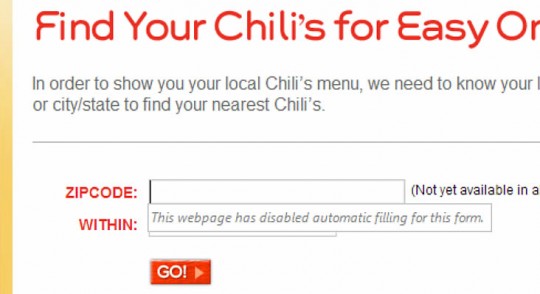
The strangest example of this was on the illustrated restaurant website – to find the closest location, I had to manually type in my zip code because the developer disabled autofill.
Needlessly Strong Passwords
Yes, sites get hacked. Blogs get hacked, and so do big company sites like Adobe and LinkedIn. So, in an abundance of caution, many sites are now demanding that users employ strong passwords. The Apple store, last time I checked, wanted a combination of upper and lower case letters and numbers. Other sites will throw in the requirement of at least one special character, like a punctuation mark. Repeated or sequential numbers and letters may be prohibited. This is excellent security practice, but it is an inconvenience for customers and may result in them not logging in at all.

Instead of making users do most of the hard work of securing their accounts, site owners need to be sure they are doing everything they can to avoid accounts being compromised. Is there brute force protection, so that repeated, unsuccessful attempts to log in trigger a temporary lock? Are login processes encrypted to prevent password theft via compromised wifi or man-in-the-middle attacks? Is user password data stored in the most secure way? [Image credit: someecards.com.]
As writer Randall Stross noted a few years ago in his NYTimes article, A Strong Password Isn’t the Strongest Security, usability is penalized by onerous password requirements. The security these passwords provide is often illusory as hard-to-remember passwords are often written down and can be compromised by other means.
Mobile users in particular may find these strong passwords problematic, since they usually have to switch to separate entry screens for letters, numbers, and special characters.
Want to really ratchet up the frustration with strong passwords? Be sure you make them expire periodically. That way, even users lucky enough to memorize their password will have to start over again.
Surprise Password Requirements
What’s worse than a site that requires you to build a password with numbers and special characters? How about a site that tells you what’s needed only after you enter one that doesn’t meet their exacting standards?

Unique, Weird Email Addresses
I just signed up with a new wireless company. They exhibited multiple examples of bad behavior, including not accepting my autofilled credit card number and forcing me to dig into my wallet to “verify” it. But the most blatant problem was their use of a different and unique email addresses for five different communications in the space of five minutes. Each address looked the same but included a unique ten-digit numeric code.
Every one of those emails ended up being routed to my spam folder. (It would’t surprise me if some spam filters used “long email addresses with numbers” as part of their spam detection algorithm. I would, because that’s how spammers easily generate new addresses.)
I’m sure there was a good technical reason for the unique emails – perhaps if I hit “Reply” it would allow my email to be routed properly. Or, maybe not. Normally, when the first email was flagged as spam, I’d add the email address to my contacts so that further emails were properly directed. But if every address is unique, that won’t work.
Could I set up a rule to keep emails from this company out of my spam folder? Sure. Will I? Nope. I don’t have the time to set up rules for every business that sends me stuff. If you email me using one address, though, I will take a second to click “Add To Contacts.”
Short Session Time-outs
Lately, I’ve encountered a few sites that terminate your session after a few minutes of inactivity. As a multi-tasker, this can be exceptionally annoying, particularly if I have to navigate through several screens to get back to where I was working before the phone rang.
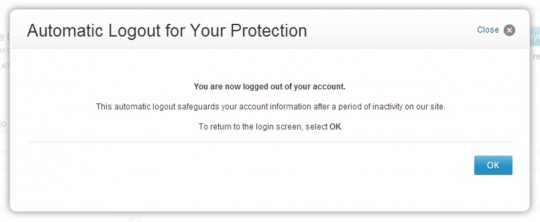
I understand that some sites need to take this precaution. A banking site, for example, might not want an account holder to go to lunch after logging in and have a co-worker transfer funds to her account in the Cayman Islands. But not all sites are subject to the same risk. Credit card sites and even wireless phone company sites do it, too. They make no attempt to ask the customer if they are connecting from a secure location (like one’s home) or a more public site, and simply log the customer off after a few minutes.
I spend a lot more money at Amazon.com than I do with my phone company, but Amazon never logs me out. Why would they? I might buy something! (Amazon does watch for potentially suspicious behavior, though, so if I attempt to ship a purchase to a new address they will add a security check.)
If your IT people are enforcing a session time-out protocol, have them provide you with analytics on customer behavior. If you find customers initiating multiple sessions within a few minutes of each other, they have almost certainly been logged out while they were still using the site. If a time-out protocol is really necessary to prevent fraud or abuse, consider extending the inactivity period to reduce the inconvenience to multi-tasking customers.
Forgotten Logins
This customer inconvenience is related to the last one, but is a bit different. User-focused sites keep you logged in as long as you don’t log out or delete cookies. This is a very customer- and member-friendly approach used by Amazon, online communities, and many other kids of sites. When you return, you are able to use the site immediately.
While it’s understandable that financial and similar sites don’t leave a persistent cookie to maintain login status, other sites with no major security concerns clear the login when the session is over. This forces the returning visitor to log in every single time. Combined with the blocking of autofill by the browser, and the visitor is forced to re-enter everything manually. Some returning visitors won’t remember their login and, rather than looking it up or guessing, will move on to another site.
A Friendly Note from “NO REPLY”
 I am truly amazed at how many businesses send emails using the name “No Reply.” This has to be the least customer-friendly way to let someone know their order shipped or that their credit card failed. It’s immediately sending a clear message, “We don’t want to hear from you. If you must communicate with us, use only the procedures we have put in place for our convenience.”
I can hear the developer protests. “We used to put the company name there, but our stupid customers kept hitting ‘reply’ even though we told them not to in big letters!” Did it occur to those decision-makers that perhaps customers replied to the email because it was their preferred method of communicating? Or that it was easier than navigating to a website and logging in (using the password they already forgot), just to tell the company it was OK to ship a partial order?
Bad Error Messages
 One of the places bad customer experience can hide is when something goes wrong. Perhaps visitors click on a browser bookmark that leads to a page that’s no longer on your site. Or, some kind of site malfunction sends them to an error page. These often don’t get checked in site reviews, and they may leave a visitor puzzled or frustrated.
Most server error messages aren’t user friendly – they may show the user something like, “502 Bad Gateway.” Not helpful, and a bit scary. Your own site may have error messages, too. For example, if a customer fails to fill out a form field correctly, he may receive an error message. Internal error messages should be checked for clarity of content, correct spelling, etc. – often, developers create these on the fly while coding.
The proper approach is to customize all error messages and be sure they are part of the site review process. Bad page requests should offer the visitor some search and navigation options. Server errors should be a message reassuring customers that a technical issue exists but is being addressed. If some parts of the site remain functional, visitors can be directed there. And if the entire site is down, a protocol should exist for routing all requests to a reassuring message promising prompt restoration of service.
Disappearing Form Data
I’ll confess: I don’t always fill out web forms right the first time. I may miss the little checkbox that says “I accept the terms and conditions.” Or, I don’t enter a date in the right format. It’s not too frustrating, though, if the site points out where I made my mistake and lets me continue after correcting the error.
What can be very frustrating is when the site points out my error but also erases some of the form data when the screen is refreshed. So, for example, after being prompted to check the “accept terms” box and resubmitting the form, I get a NEW error. Now, the security code from my credit card is missing. I filled it in once, but when the form refreshed it went away. Now, I have to dig out my wallet again, take the card out, and re-enter the code. And, of course, pray that some other field didn’t get wiped.
I’ve seen forms get better over time – a few years, ago, it wasn’t uncommon to see an entire form get wiped clean after an erroneous submission. It still happens, though. Try bungling a form entry to see what a careless or fumble-fingered customer might experience.
Test, Test, Test
The best way to prevent your visitors and customers from running into these frustrating experiences is to test your site by first doing everything as a new visitor would, and then doing the same as a returning visitor. If your site has a login, test in both logged-in and logged-out status to see how the experience varies. Then, experiment by doing things wrong. Load a non-existent page, botch your login process, mis-enter or skip form data, and so on. Your real-world visitors will do all of these things, and if you don’t proactively test they will be the ones finding the hidden land mines in your customer experience.
For a good analysis of the security/customer experience trade-off, read When Security Gets in the Way by usability expert Don Norman. And any discussion of this topic would be incomplete without mentioning Steve Krug’s classic, Don’t Make Me Think.
Are you trying to build a customer-centric culture? You will have to involve not just customer-facing staff and marketing, but every other function – developers, security people, legal staff, etc. One way to do this is bring in one of the many excellent customer experience keynote speakers to inspire and motivate the entire organization.
Be honest – how many of these frustrations are on your site right now? And what other customer experience flaws have you encountered lately on other sites? Leave a comment to share your experience!