[Guest article by Alex Birkett]
Home is where the heart is, and when it comes to eCommerce conversion optimization and improved user experience (UX), it’s where the money is, too.
More often than not, it’s the page with the highest traffic, and it’s almost always the page that is most focused on by optimizers and marketers.
Every department wants their own piece of the homepage, and often good UX isn’t their first priority.
What Are the Goals of a Homepage?
First thing’s first: what’s the goal of a homepage? We can really narrow its purposes down to two goals:
- Explain the value proposition as clearly and convincingly as possible.
- Get people off of the page and on to the next step in your conversion funnel.
While this seems simple, there’s a lot that goes into it. As you know, many of these functions are unconscious – subtle tweaks in layout, copy, and imagery can drastically affect both goals.
There have been dozens, maybe hundreds, of A/B test case studies focusing on the homepage. Still, though, there is so much to learn about optimizing this crucial site space.
So we put ourselves to the task of researching common UX elements – things like visual cues, social proof, and value propositions – and conducted a series of experiments through ConversionXL Institute.
Lab tests at @ConversionXL show 3 ways to tweak your homepage for best #UX and #CRO Click To TweetWe’re still running experiments and learning more every day, but below I will outline three important studies that together could provide a substantial lift to your marketing efforts.
Does Value Proposition Presentation Really Matter?
We all know the importance of a value proposition.
It is one of the first things you should optimize when you’re starting out, simply because of its impact and reach.
A quick reminder of what a value prop is: It’s simply a promise of value to be delivered. It’s the primary reason a prospect should buy from you.
Anyway, there has been lots of research on value propositions – both academic (if you were in Business School, you’ve studied value propositions) and practical (case studies galore online).
We wanted to study something new. Instead of looking only at the content of the value proposition (copy, images, etc.), we looked at how you present your value proposition.
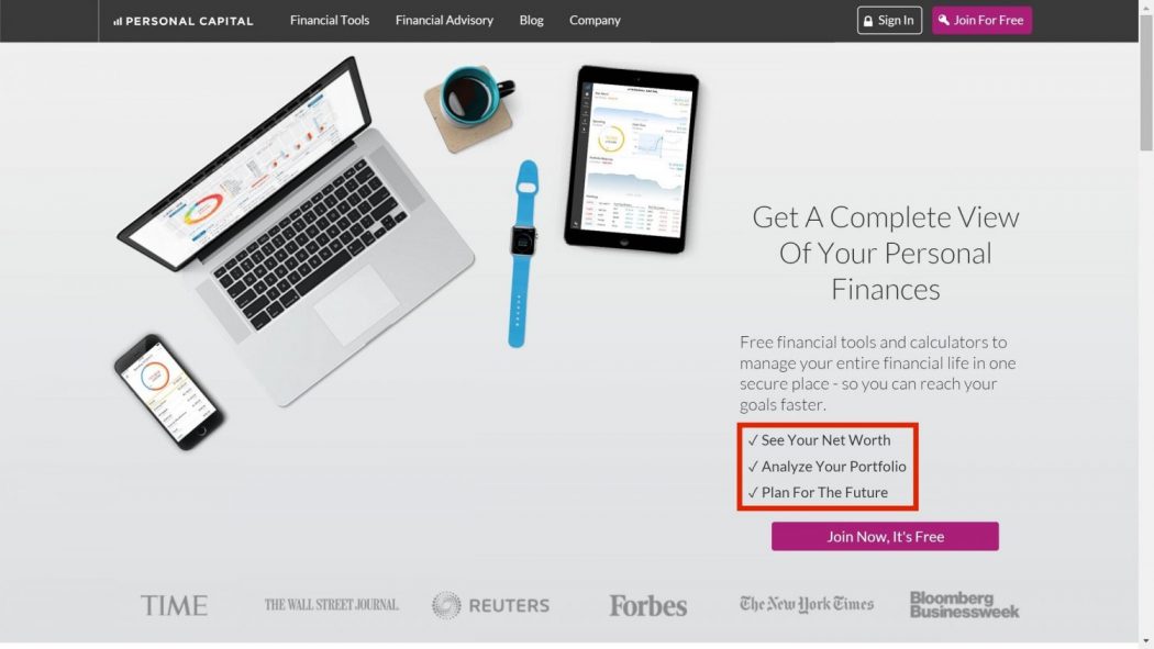
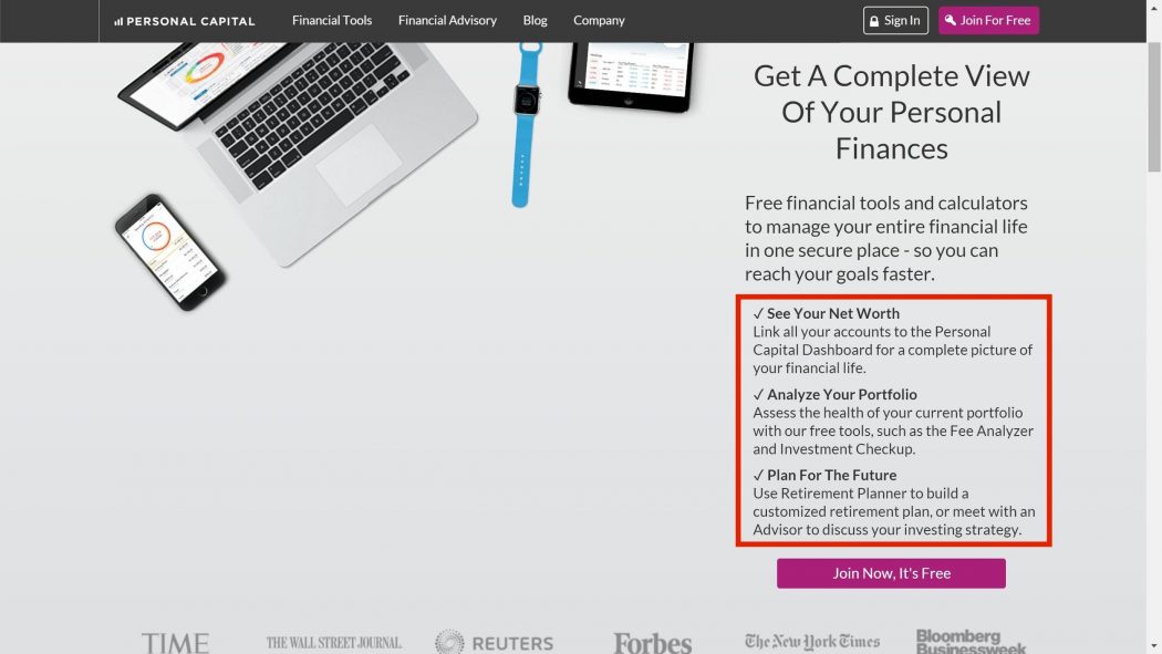
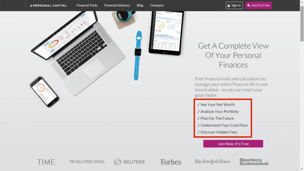
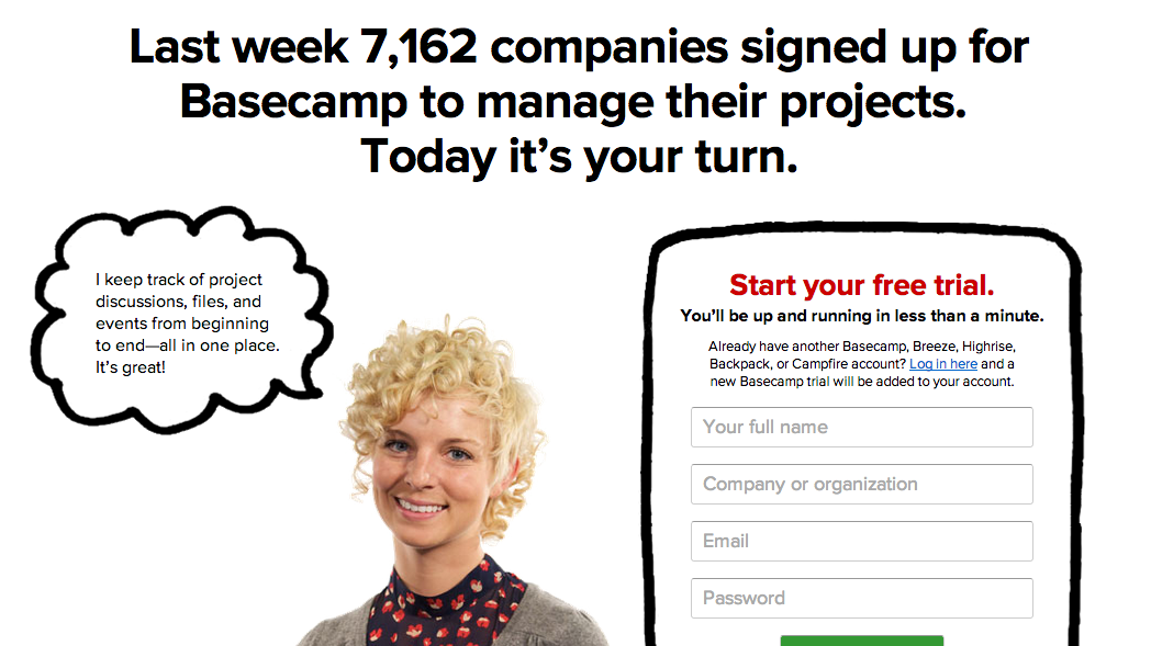
So we manipulated the homepage of personalcapital.com and used eye-tracking and a post-task survey to explore four variations. We were looking for attention as well as recall of features.
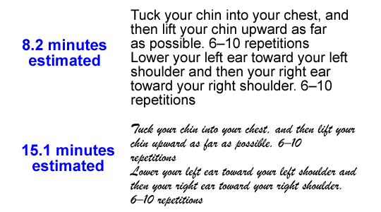
Three bullets:
Three bullets with descriptions:
Five bullets:
A paragraph description:
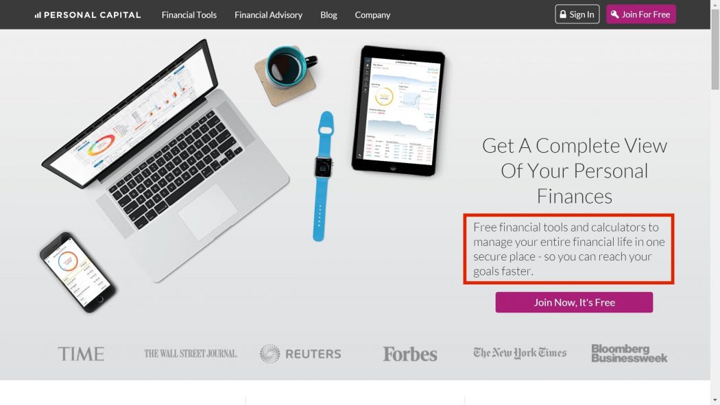
The results?
Users noticed the value proposition more quickly when it had more text (took up more real estate on the page), and they also spent longer on it when there was more to read.
In addition, the more info there was in the value prop, the more information people were able to recall. They were able to list more advantages of the product when there were more features and benefits to read about.
The takeaway?
If you want people to actually read the value propositions you’re composing, limit other elements on the web page. Elements that stay on the page should be extremely relevant to the value proposition message.
Which makes sense, right? Your page should have a focus on its most important message.
Further, we found that misunderstandings of the services offered for the test site were overwhelmingly due to the ambiguous image of the computer and phone; people thought about “selling computers” or focused on just one of the site’s features, “connecting all devices”.
So, for best UX and conversion, align the other site elements with what your value proposition is trying to convey.
Test explicit descriptions of features and benefits in your copy, avoid frilly wording. In this study, it seemed that the more info, and the more detailed that info, the better people recalled it.
Lab result: Align design elements with a clear value proposition for best conversion. #UX #CRO Click To TweetSocial Proof: Which Kind Works Best?
Social proof is a well-known and commonly used persuasion trigger popularized by Dr. Robert Cialdini.
It’s an especially important tactic online, where you can’t see, feel, or hold the product. Social proof essentially tells people, “Hey, you can trust this product or service because other people like you trust this product.”
Problem is, there is an infinite amount of ways you can portray social proof. You can list the number of companies using your product or subscribing to your list. You can show photograph + text testimonials. You can show social media icons. On and on the options go…
We wanted to get a grip on which methods were more or less effective at garnering attention, as well as eliciting recall. So we conducted another eye-tracking experiment (with a post-task questionnaire as well).
We manipulated Host Gator’s home page to study eight variations:
- Press mentions with logos only.
- Press mentions with logos and short quotes.
- Testimonials with photos.
- Testimonials without photos.
- High profile client logos.
- Low profile client logos.
- High social following.
- Low social following.
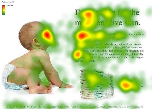
And we also had a control page, which had no elements of social proof. Here’s the control:

We placed the social proof on the bottom part of the screenshot, in the dark blue bar.
So which type won?
As is usual in research like this, the answer is somewhat complicated.
The different social proof types didn’t differ significantly in how quickly they attracted user’s attention, but they did differ in how long people paid attention to them.
People spent longer looking at the ones with more text (the two testimonials and the press mentions with short quotes), which makes sense due to the cognitive processing involved. Just as more difficult fonts make it so people read passages for longer amounts of time, if there is more text, people simply take longer to read it.
There were interesting and actionable findings in our study, though:
- People recalled high profile client logos more than low profile logos.
- Testimonials with photos were significantly more effective at generating recall.
So use photos, and if you have high profile clients, show them off!
Lab result: Photo testimonials, high profile logos are most effective social proof. #UX #CRO Click To Tweet
Caption: High-profile client logos were effective at generating attention and recall.
Look This Way: How Visual Cues Direct Attention
Visual cues are commonly used by user experience designers and optimization specialists to direct the attention of users to a desired element or area.
We know from past research that visual cues are generally effective at directing attention. Maybe you’ve seen this example…
Visual cues suffer the same problem as social proof, however: a vast amount of different kinds of visual cues are available for use.
You could use arrows, lines, photos of people, borders, pointing fingers, bright banners, exclamation points, check marks… the list goes on.
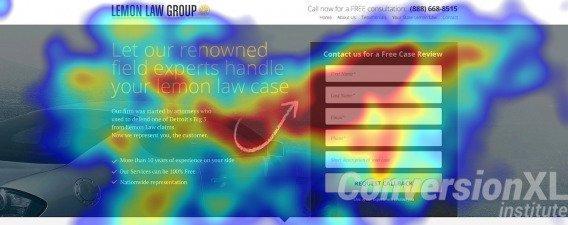
To weed out some answers, we manipulated the landing page of a law firm with six different types of visual cues (some of the most popular types). We used eye-tracking to measure fixation and attention, and we gave participants a post-task questionnaire to measure recall.
The six types of visual cues we studied were:
- Human looking away from the form.
- Human looking towards the form.
- Arrow.
- Triangular.
- Line.
- Prominent form.
Finally, we had a control with no visual cues.
The results? Surprising, actually.
While there was no difference in time-to-fixation (when users first noticed the form) or recall, there were differences in where they directed attention and for how long.
The best type of visual cue? Hand drawn arrows:
The worst? Human looking away from the form:
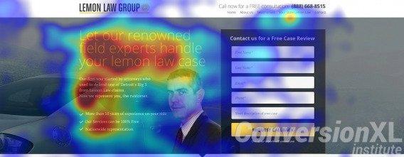
The eye-tracking heat maps make it very clear that what visual cue you use can make a big difference in where users direct their attention.
So, test hand-drawn directional objects (e.g. an arrow) for guiding the attention of users. If you have a human as a visual cue, at least have them directing their gaze towards the object you’d like users to see.
Lab result: Hand-drawn visual elements work best to guide user attention. #UX #CRO #webdesign Click To TweetConclusion
Small tweaks in layout and presentation on your homepage can have significant results in terms of how people view, remember, and interact with your site. To review, this article mentioned three studies and here were some of the takeaways:
- If you want people to actually read the value propositions you’re composing, limit other elements on the web page. Elements that stay on the page should be extremely relevant to the value proposition message.
- Use high profile logos for your social proof, and pictures are generally better remembered than text.
- Test hand-drawn arrows for visual cues.
Of course, your results may vary. Optimization is always contextual, and your audience may react differently. But these studies shed some light on practices that may work more often than not, and therefore, they offer a good opportunity for experimentation.
Finally, I didn’t mention the specific statistics and sample sizes of our experiments because frankly, it deters from the narrative and it gets quite heavy. There are also limitations to our studies. All of this, and more, is addressed in our full studies. You can read our studies in their entirety if you’re interested:
Lab tests at @ConversionXL show 3 ways to tweak your homepage for best #UX and #CRO Click To Tweet
Very good post Alex,
Most marketers should focus on the main point instead of promoting other kind of elements that yes, could be very beautiful, but useless.
Your article show with images just data that can identify what’s the best solution and it really helps.