Whether you are writing an article intended to persuade, designing a commercial website, or building your slide deck to pitch your big idea, you can give your credibility a boost with one small change.
A recent experiment gave subjects an ad that described a medicine effective in treating a particular illness. Only two thirds of the people who read the ad, however, believed that the medicine worked.
Then, the experimenters added one element: a chart that displayed the same data. This small change caused the percentage of readers who believed the drug to be effective to leap from 67.7% without the chart to an amazing 96.6% with the chart.
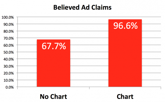
The study was conducted at Cornell by Aner Tal and Neuromarketing favorite Brian Wansink.
One of the things the experimenters tried to determine was why a chart seemed to be so powerful. Was it the better visualization of the data, or the veneer of scientific rigor suggested by the chart? They concluded that it was the science, or at least the appearance of science.
Got Data?
You may not always have academic research to illustrate your article or slide deck. In that case, you can often create simple data that is still persuasive.
For example, say I wanted to show that blog posts with charts were shared more than posts without that kind of imagery. Here’s a simple chart (with supporting numeric data for added credibility) that I created by comparing five recent posts containing charts to the posts preceding them:
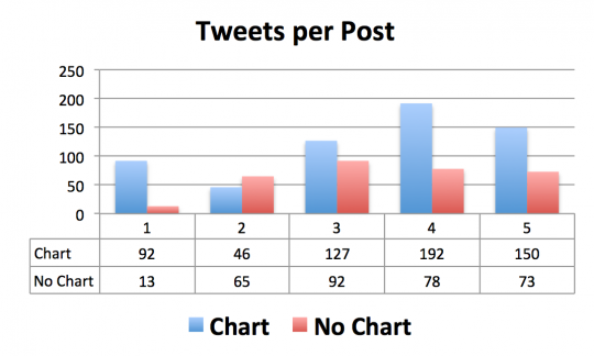
A casual glance at the chart certainly suggests that my research bears out the positive impact of charts on social sharing.
In reality, even though this data is accurate and unbiased, it is in no way a robust enough sample to prove that posts with graphs get shared more. I include it simply to show that data can be obtained in many ways, and that graph data tends to look persuasive.
Be sure that any persuasive charts you create are honest and statistically sound. If you cut corners (as I did in the tweets per post example), some portion of your audience will see through it and call you out.
Beyond Charts
It’s not just charts that give your content a science-based boost.
In Your Claim + Math = Credibility! at Forbes, I described how even readers with advanced degrees in math and science could be swayed by adding “nonsense math” to a paper’s abstract.
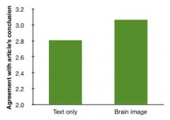 I also wrote about research that showed a neuroscience paper into which irrelevant brain scan images had been inserted was found to be more significant than the same paper without the bogus pictures. See Brain Image Bias for more. (Note that long before the new research on charts, I bolstered the credibility of that post by creating a graphic for the display.)
Infographic Implications
Infographics have become strangely popular. While some do indeed simplify data and help the viewer visualize the numbers, many others take a few mediocre data points and make them visually attractive, or even arresting.
I haven’t seen research on whether infographics are more credible than text, but I’d guess in some cases they could be. When numeric data is presented in a visually appealing, well-organized way, it may seem a bit more scientific to the viewer. Many infographics use scientific-looking imagery, which could give them a boost in believability.
The Big Takeaway
The research demonstrates one inescapable conclusion: including charts and other scientific-appearing content makes the exact same data more credible.
If you want your data to persuade, graph it!