When Lead Generation Trumps Helping Customers | #FrictionHunter
Which is more important on your website? Helping potential customers, or turning them into leads? Lead generation is important for most businesses, but your choice can have a big effect on customer experience.
[IMPORTANT NOTE: I began working on this post last year. Since that time, all of the sites have changed their user experience. Treat what follows as an illustration of different CX/UX approaches, not a critique of the current experience offered by these brands.]
After five years of using a MacBook Pro, I decided to check out the latest in Windows-based laptops. Most tech writers seem to think the vigorous competition in the Windows space has evolved PC technology more quickly. At the same time, the Macbook Pro’s biggest distinction, the touchbar, hasn’t taken the world by storm. So, I decided to pay a quick visit to a few big PC makers.
In general, I found their sites fairly confusing for someone not already looking for a specific model or series. My main criteria were light weight (maximum of 3 pounds or so), 13 – 14″ screen, reasonably advanced processors, 16MB RAM, and a 1TB SSD drive. Touchscreen/tablet functionality would be a plus. These seem like very simple criteria, but finding laptops that met them proved to be a higher friction experience than I anticipated.
HP: Too Much, Too Soon
HP was the first site I visited. To find my ideal laptop, they first wanted me to choose a category – business, premium, or traditional laptops. Convertibles and detachables were yet another category. I guessed that my needs were probably “premium,” but “business” seemed logical as well. And, if I did want to explore a PC with tablet functionality, that would be a different area.
As I was stumbling around various the product lines without much success, a little chat invite popped up.

So, I decided to stop blindly searching in favor of being directed to a specific model or two. I clicked on the chat invite, and, rather than seeing a chat box, I got a form.
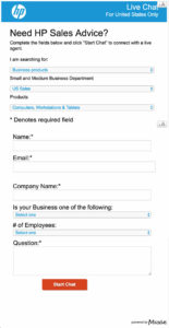 What surprised me was the length of the form and the questions. It’s customary to get the customer’s first name and perhaps an email address so that a chat transcript can be sent.
The form at HP.com looked much more like a lead generation form – asking for things like last name, company name, business type, and number of employees. Why would they need to know the number of employees to answer a simple product question? Even though the business type and employee count aren’t required fields, they still seem over the top for a chat help request.
Even the first question was a bit confounding in my case – they want to know if I’m searching for “business products” or “consumer products.” I imagine that the kind of laptop I was searching for might be either, so which would be the more logical choice? Also perplexing: my first guess at a category when I got to their website, “premium,” wasn’t even a choice.
Sales leads are good. But, don't let #LeadGeneration get in the way of helping new customers. #CX #UX Share on X
I looked at the rest of the form and decided to give up at HP. I just wanted a little direction, not to become part of a follow-up marketing campaign. It’s entirely possible that HP had other reasons for asking for all this information, but for me it was too much, too soon. When a visitor has a very basic question and self-service tools are limited, it’s a bad idea to make that visitor complete a rather long, intrusive form just to get help.
Oddly, while trying to browse products at HP I encountered intermittent errors:

These seemed to be transient, but weren’t confidence-building. I moved on to Lenovo and Dell.
The Filter That Filtered Too Much
 Lenovo did a better job – they had a configuration tool on the site that let the visitor put in things like screen size and storage numbers to suggest models. It was a good idea, but it seemed to be broken. When I added the “1TB” criterion, it only showed a couple of cheap models with 1TB hard drives. When I removed the “1TB” checkbox, it immediately displayed a model with a 1TB SSD, exactly what I wanted. That model also had 16MB of RAM, which was not even a choice in the filters. (The maximum in the filter dro-pdown was 8MB.) Eventually, I found that choosing “32 GB Solid State” in the hard drive drop-down displayed all SSD drives – unexpected behavior that could confuse customers.)
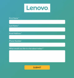
Lenovo, too, had a chat box. It wasn’t quite as intrusive as HP’s and didn’t feel like a lead generation form. But, it still had five fields, including last name and phone number. The latter field was optional. As I had found what I wanted, mostly without the help of their product filter tool, I didn’t engage with a chat rep.
Lowest Friction: “Ava” from Dell
My last stop was Austin-based Dell. Their site had a very transparent configuration filter arranged as a left sidebar. Choices were easily visible. Like Lenovo, though, the 1TB SSD requirement was problematic. One could specify “1 TB” or “SSD,” but not both. The secret, I found, was to select just “SSD” and then look for a 1TB option later in the product configuration process. This worked, but a more obvious choice in the filter would have been better. Many customers might assume that “1TB” would show both hard drives and SSD drives of that size, which isn’t the case.
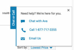 After an initial search or two, I decided to click on the “Chat or Call” button pinned to the edge of the screen. In what is definitely a best practice, Dell offers the visitor three options – “Chat with Ava,” “Call,” or “Email.”
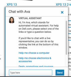 Ava, it turns out, is a chatbot. Or, as Dell puts it, an “automated virtual assistant.” (Ava – get it?) There are three good things about Ava:
- She’s ready to help – no form to fill out, no personal info demanded. Ava’s job isn’t lead generation.
- She’s good at answering questions.
- She offers the option of a live representative on the very first screen.
My experience with Ava was better than with many human reps. She efficiently responded to several questions with helpful links. When I couldn’t locate the weight for a particular laptop, I asked her – she immediately furnished the correct information.
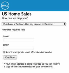 And, if you preferred a human, that was easy, too. One link took me to a chat form that was simple enough. A quick drop-down asked me to choose between gaming laptops and all others. Name and email were the only two fields that need be completed. A first name would be sufficient and the email box noted that it was for the purpose of sending a chat transcript if desired.
How To Make Getting Help Easy
Offer Multiple Channels. If your objective is to help customers, the first thing to do is offer the customer options, including easy self-service. None of the sites I visited offered a dead-simple way to find a product that met my minimal criteria, although Lenovo and Dell’s search filters were a good start.
And, when a customer decides to seek more active assistance, multiple channels should be available and obvious. Opening the “Chat or Call” tab at Dell made it clear that chat, phone, and email were all fine, with links to each method. Selecting the chat option further allowed either the bot Ava or a link to chat with a human rep. Every customer has different preferences and needs, and multiple help channels allow them to choose the one that seems best.
Offering a human option alongside Ava makes customers feel that they can switch easily if they aren’t getting the right answers. It’s a bit like a phone menu system that lets you know you can say “representative” at any time to reach a human. Providing that safety valve ensures the customer never feels trapped in a series of tedious menus. For me, knowing that a human was available encouraged me to try self-service with Ava first.
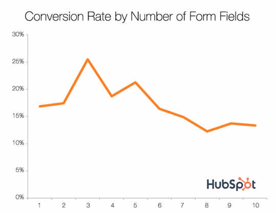
Form Fields are Barriers. It’s well-established that fewer fields in a form almost always lead to a higher conversion rate, i.e., more visitors hitting the “submit” button. That doesn’t mean that one always wants fewer fields. Adding a few qualifying questions to a sales inquiry process can serve a dual purpose. It will discourage the most casual form-fillers (who may not be good leads anyway), and it will help determine the best way for sales to follow up.
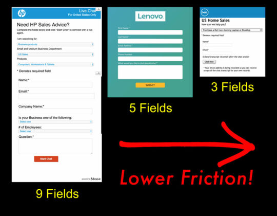
Here, discouraging form submission is not a good idea. The purpose of a website chat function is to help customers through sales process, e.g. that means helping customers find and choose products. HP’s many from fields may be designed to generate leads, answer market research questions, or at least guide the chat responder, but they are off-putting to a customer comparing brands and products. As soon as you start trying to achieve multiple objectives, you detract from the primary goal of helping as many potential customers as possible.
Lenovo’s form is both cleaner and shorter than HP’s. But, asking for “Last Name” to initiate chat help seems unnecessary. And, asking for a phone number has been shown to reduce conversion rates. In one test by the University of Wisconsin-Extension, requiring a phone number dropped conversions by 52%. The Lenovo phone field doesn’t have the tiny “required” asterisk, but not all visitors will notice that.
Dell, on the other hand, does most things right. Notably, their human chat form has just one dropdown and two text fields, just about the minimum needed to start a chat. It doesn’t feel like a lead generation tool. In fact, three fields has been shown to be a sweet spot for maximum form submission in a study of 40,000 landing pages.
Dell also explains why they want your email address – to send you the chat transcript. If you must ask visitors for identifying information, explaining why you need it is reassuring. Eliminating fear and uncertainty will increase conversion rates.
Occasionally, a form with many fields can be useful. In my book Friction, I describe a “big ugly form” that was so intimidating, no visitors actually filled it out. The contrast with a simple, toll-free number, though, boosted the preferred response, telephone leads.
Friction Takeaways: Help Trumps Lead Generation
- Think easy. If you want to help customers choose the right product, make it easy! Start with self-service tools like search filters based on common criteria. Every step should be intuitive. As Steve Krug would say, don’t make your customers think. Sometimes, helping the customer first is a better way to generate leads.
- Watch out for jargon. Don’t assume that your customers know the difference between “premium” and “business” laptops like HP, or even that they know if a “business” or “consumer” unit will best fit their needs. Distinctions that seem obvious to you may not be obvious to your customer, even in less technical fields.
- Offer help options. When customers need more help, give them multiple ways to access it, including live humans. A mobile customer might prefer a phone call, while a desktop user might be fine with chat or even email. Dell’s Ava chatbot is a nice bridge between self-service and human assistance that can be accessed without any form at all. The link to the human chat option is always visible.
- Minimize forms. If you really want to help your customers, don’t throw up unnecessary barriers. Dell’s simple three-field chat form doesn’t scare off customers by asking for identifying information. At the other end of the spectrum is HP’s high-friction form that feels more like a sales lead generation form than a simple chat request.
- Test, test, test. Finally, use analytics and testing to optimize your process. I’d love to know how many visitors to HP.com open the chat request window and close it without submitting the form. A simple A/B test would show if reducing the form length to two or three fields would result in more visitors being helped. Testing will allow you to strike the best balance between lead generation and other important goals.
